Heading
1. Introduction
1.1. What is heading for us?
Headings act as signposts, guiding users through your interface. Generally content designers prefer darker fonts to grab attention and explain the current topic. Ideally, headings should also nudge users towards a specific action at the end of their journey.
While buttons can accompany headings for immediate action, they often rely on body copy for context. Since users tend to skip body copy, headings must effectively convey the subject matter. However, this doesn’t necessitate longwinded explanations. Brevity can be clear and impactful.
2. How to write headings?
2.1. Headings include a product name
When crafting headings with product names, focus on user benefits and action prompts. Keep them concise and avoid long explanations. A clear product name is key!
2.2 Character limits and readability
While a specific character limit can’t be recommended due to design system variations, prioritize maximum of double-line headings for optimal user interaction across different text field lengths.
2.3. Crafting effective headings
To write a strong heading, first grasp the topic thoroughly. Then, unleash your creativity! Headings can stand alone or be part of a hierarchy, with main headings and subheadings providing additional structure.
Next, let’s dive deeper and explore the secrets of crafting captivating headings, as vibrant as a coral reef!
2.3.1. Highlight benefits
Highlighting opportunities always works. Not everyone needs to be aware of Turkish Airlines’ exclusivity. Inspire them.
Reachable privilege: Miles&Smiles
Unlock exclusive Miles&Smiles benefits!
2.3.2. Spark curiosity
What ignites the spark for travel is arousing curiosity. For this reason, we produce substantial content in our blogs. You also need to keep curiosity alive when creating headlines.
Keep calm in Bali… Read more in our blog
Discover Bali through Turkish Airlines Blog
2.3.3. Don’t ask, trigger action
In UX Writing, asking questions is not a terrible thing. However, as a general principle, it should be used where appropriate. When creating headings related to products, you don’t need a question but rather to tell the user something. There’s no user inner voice here. It’s your voice that needs to stand out. Therefore, trigger action.
How to redeem your Miles on many countries?
Redeem your Miles over the world
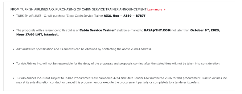
2.4. Tender Notices
2.4.1. Don’t use any punctuation
It isn’t used due to the heading rules.
2.4.2. Narrate a formal story
It naturally a formal process. Please follow the brief of the authorised person and make the text user-friendly.
2.4.3. Use bullets
To make the text understandable, use bullets while narrating the story. Leave one line space among bullets, if possible.

3. Punctuation in headings
3.1. Periods
Never use periods. Headings are a form of greeting for Turkish Airlines. After greeting, we ensure the continuation of the experience. That’s why we never put a period in headings.
3.2. Commas
Use commas to separate multiple items in a list or when necessary for proper number formatting. Avoid unnecessary commas, especially within headings.
3.3. Exclamation mark
A writer likes to write enthusiastically. We’re not against using exclamation points in the headings. We are only against exclamations used unnecessarily. Read the content you designed out loud. Does it really excite you? Will it sound genuinely to our users? If yes, use it.
In Arabic, an exclamation mark does not convey a positive meaning. Therefore, always consult with a local content designer when using it.
3.4. Question mark
Do not use question marks, except in phrases like the FAQ where we naturally ask a question or ask the user what they would like to explore. Do you want to start the topic by asking a question? Only do this if you have to.
In Spanish, a question mark is used at both the beginning and the end of a question. It provides a clear indication that a question is coming.
3.5. Colon, semicolon
Avoid using colons and semicolons in headings. Similar to periods, they imply a continuation in a structure, which feels like over-design in headings.
3.6. Hyphen, en dash, em dash
Use hyphens, en dashes, or em dashes sparingly, only when required for grammatical clarity or to enhance user experience.
3.7. Asteriks
There may be situations where a headline contains an asterisk. These usually indicate legal topics that require further explanation. Don’t worry about interrupting the experience. You’re doing it because it’s necessary.
Except a dash. Otherwise follow the heading rules. Here is the best cases:
Special Offer* – Limited time only
Turkish Airlines awaits you*
Ever explore Bali?*
4. Heading types
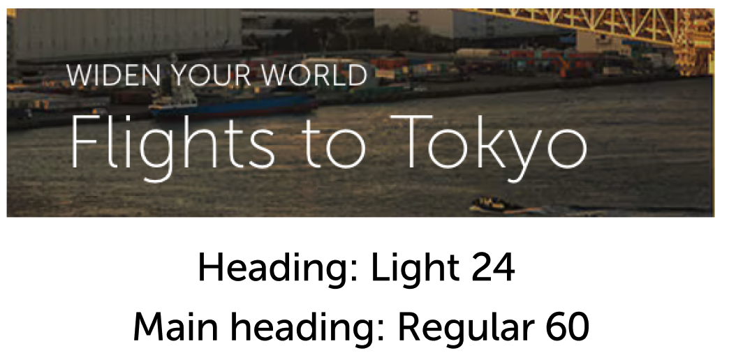
4.1. Main headings
4.1.1. What is the main heading for us?
Main headings are the supporters that speak to the heading, nourish the expression and increase its impact. A warm welcome message, a candid hello or an introduction where we widen the user’s horizons.
4.1.2. In which types will you face them?
Although this structure is not used frequently, its most basic example is viewed in “welcome banners” and “city guides banners”. In these cases, main heading is written in a thinner and smaller font type than heading.

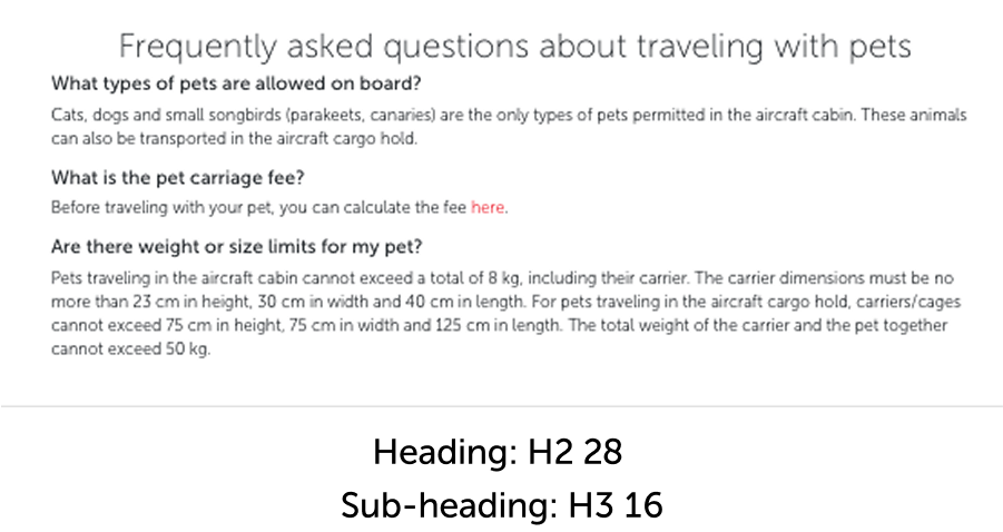
4.2. Sub-headings
4.2.1. What is the sub-heading for us?
Subheadings are excellent tools for helping users categorize information based on their mental models. Establishing a correct hierarchy is crucial for accessibility, findability, and discoverability.
4.2.2. Key principles
- Accessibility: Users should easily find the topic they’re looking for by browsing under the heading.
- Readability: The subheadings and content should be clear and easy to understand.
4.2.3. Effective subheadings
- Breakdown the main topic into a list of similar subtopics.
- Include relevant keywords that users might search for.
4.2.4. Effective subheadings
- Breakdown the main topic into a list of similar subtopics.
- Include relevant keywords that users might search for.

5. Headings usage
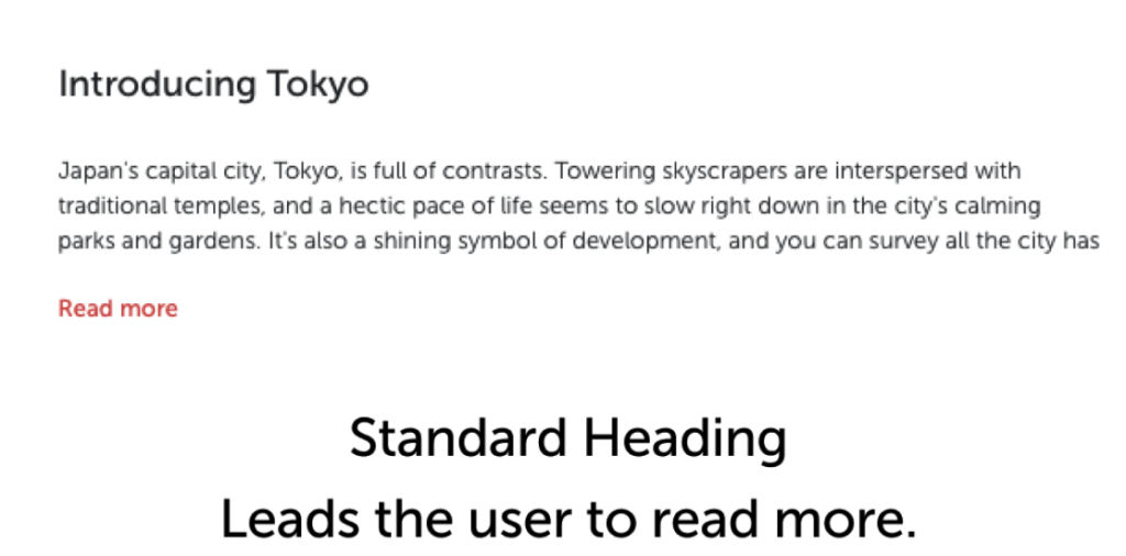
5.1. Card headings
Within the design system’s various card structures, headings play a crucial role. To succeed in different contexts, the heading should offer a clear preview of the topic being explained.
5.1.1. Balancing brevity with user understanding
Users generally scan and act without fully reading. To prevent this, headings should be concise yet informative. Don’t write long sentences, but rather provide actionable hints that resonate with user needs.


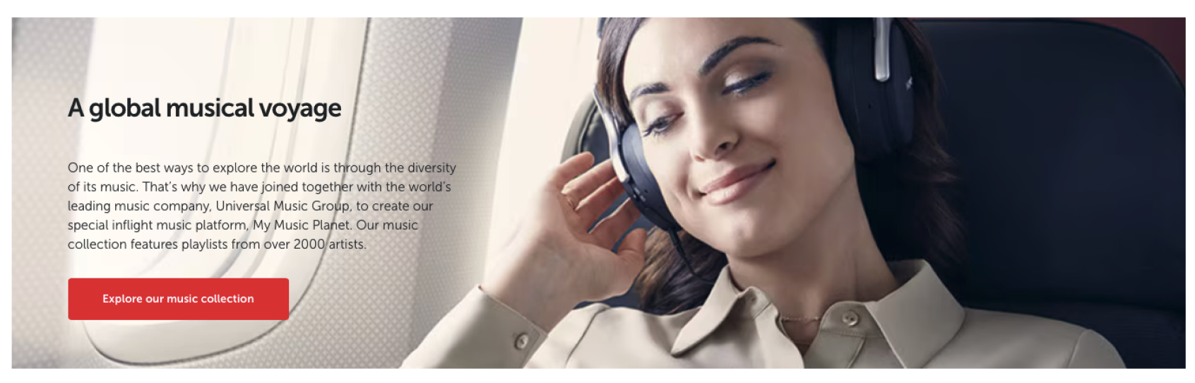
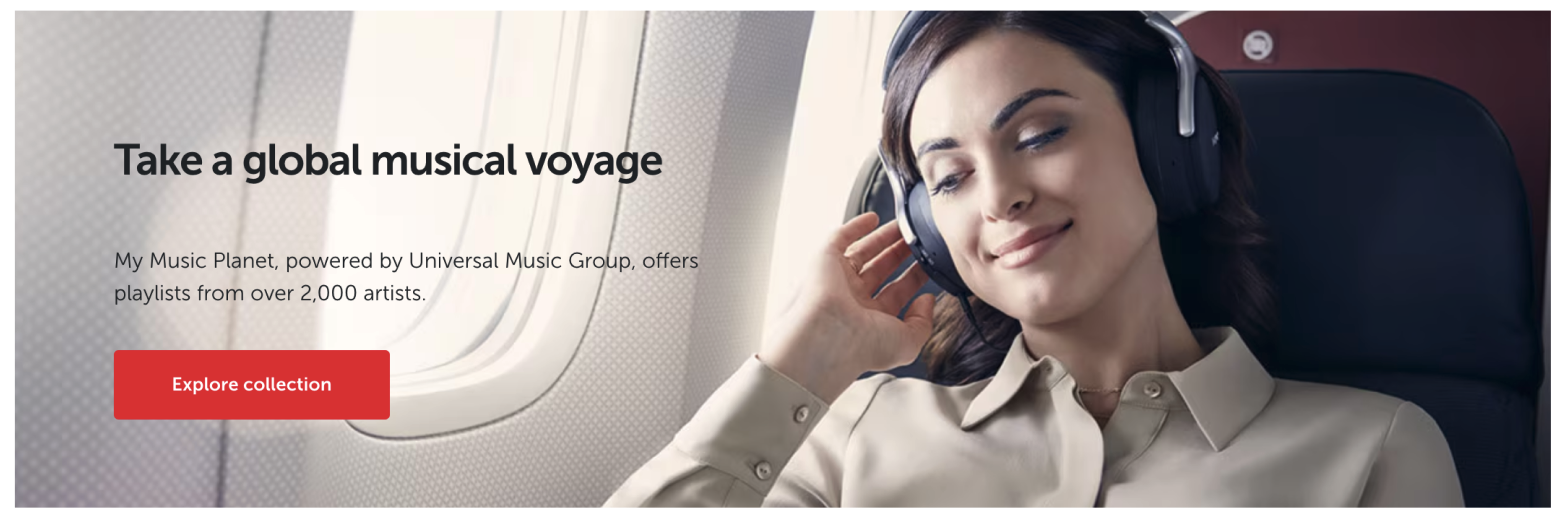
5.2. Banner headings
Strong visuals simplify our job, but crafting equally powerful, impressive, and user-friendly headings becomes more challenging.
5.2.1. Encourage exploration
The purpose of banners is to expand user horizons and showcase Turkish Airlines’ comprehensive services. When crafting banner headings, unlike cards, you can adopt a more eye-catching, intriguing language that encourages exploration.
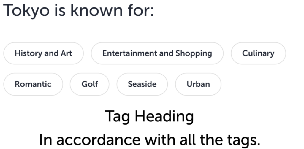
5.3. Tag headings
Turkish Airlines constantly flies to many parts of the world. Therefore, we need to produce content about interesting cities of the world. Naturally, we use tags to collect similar interests of our user.
5.3.1. Listing tags
- Do not use a straightforward title.
- Increase the value of the tags with a title that the user will really want to explore and that will make them want to buy a ticket and go.
- Do not use punctuation.
- It is not only yours but also the UXD’s duty to make the user understand that headings and tags are a family.
5.4. Error and empty state headings
5.4.1. Make sentences
Convey your message in the heading. Even if it is an important error message, the user wants to understand the problem at the beginning.
5.4.2. Be aware not to use punctuation
We try to follow the AP style while writing in English and so headings typically don’t include punctuation unless it is part of a proper nounr or necessary for clarity.
Standard practice is to avoid ending a heading with a period. However, commas, colons, or other punctuation marks may be used within a heading when needed for clarity or accuracy.
Your Session Has Expired.
Your session has expired.
Your session has expired
What Will the Policies Mean for you
Exciting News From Miles&Smiles
What will the policies mean for you?
Exciting news from Miles&Smiles!
5.4.3. Keep statuses to yourself
Grouping errors into different statuses doesn’t mean users need to know them. If you show expressions like warning, attention, etc., you might cause a minor panic.
Discuss this with your UI designer. Focus on conveying the statuses of error messages that warn the user, indicate an urgent situation, or just provide information through design elements.
Attention
We cannot process your transaction at the moment.
We are unable to process for now.
5.4.4. Politeness begins in the headings
Just as speech continues in the manner it begins, so should conversational writing. Therefore, show your politeness in the headings. In an error message, explain the situation politely. In an empty state, politely inform the user of what they might have missed.
You must fill out all required fields!
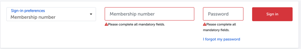
Please complete all mandatory fields.
Your saved flight cannot be found.
No flights saved. Add now to track your trips.
5.4.5. Don’t avoid responsibility
Passive voice is an unacceptable error. This tone suggests a lack of responsibility. Use an active tone in error message headings.
Special characters should not be used.
Please avoid special characters.
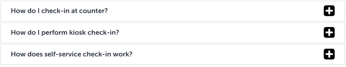
5.5. Headings in dropdown components
Dropdown components other than the input fields appear specifically in the FAQ and the Tender Notices.
Since the scope of the service provided by Turkish Airlines is quite wide and our products are quite numerous, the headings in these sections are separated from other heading structures with clear lines.
5.6. Headings in FAQs
5.6.1. Use question mark
It naturally contain questions and must be completed with a question mark.
5.6.2. Follow the assigned the font and size
It should be written in medium size and 12 point font.
5.6.3. Do not use inexplicit expression
The question must be asked clearly.
5.6.4. Always provide the clarity
If the question gets longer, clarity might be lost. In this case, instead of using “or”, split the question in half. Even if the answer is the same, place it one below.