Visuals
1. Introduction
1.1. What do we mean by “Visuals”?
Selecting the right visual is as important as writing the right words. Visuals communicate who we are, our perspective, and our vision. Whether you’re selecting images for a blog, website, or app, this guide will help you. Think of visuals as an extension of our tone of voice—consistent, clear, engaging, and inspiring. Here, you’ll find guidance on choosing visuals and everything you need to know about accessibility in visuals.
2. Principles
2.1. Be consistent
Avoid mixing styles within the same content. For instance, don’t combine a graphic, a landscape photo, and a portrait. The visuals should complement each other and feel like part of a cohesive whole.

Using images with mixed visual languages gives an amateur impression. We are professionals, and we don’t want anyone to think otherwise.
Consistency makes the design clear, easy to understand, and more professional.
2.2. Communicate clearly
Our passengers may not have time to read all the content. Use visuals that guide them to the most important information, helping them decide what to focus on.
2.3. Treat visuals like headlines
Choose visuals that represent the content below them. The image should summarize the main message of the text.


2.4. Choose simple images
Avoid visuals with excessive details that require careful analysis. Opt for clean, easily understandable images that convey their message at a glance.
2.5. Spark curiosity
The more engaging your visuals, the more likely users will explore the content. Select images that capture attention and pique interest.

2.6. Care seasonal and cultural relevance
Use visuals that resonate with the time of year or cultural context of the audience.

3. Image selecting categories
3.1. Quantitative visual selection
3.1.1. Use high-quality images
Never use images below 1400px resolution. Consider different devices and screen sizes, ensuring visuals are sharp even on large displays.
3.1.2. Use licensed images
Always ensure your visuals are properly licensed to avoid legal complications. Protect yourself and the brand by avoiding unlicensed content.


You wouldn’t do this, but we’ll remind you anyway. Always use properly licensed images.
3.1.3. Avoid overused images
Steer clear of visuals that appear frequently or are overly generic, such as the first images on internet. Instead, strive for fresh, unique content.

3.2. Visual composition
3.2.1. Focus on aesthetics
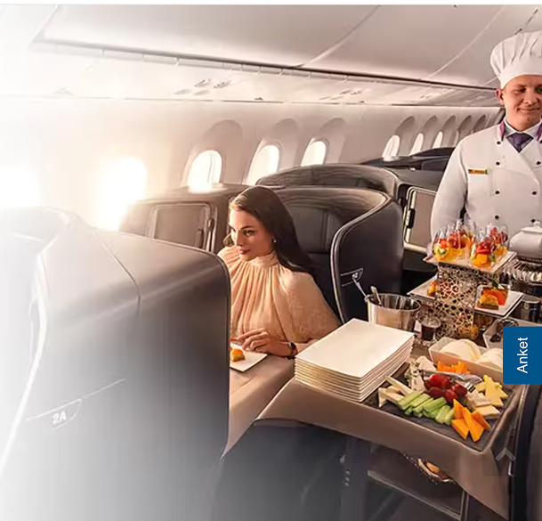
Our goal is to evoke a sense of desire in our audience. Choose high-quality visuals with strong photographic elements that reflect elegance and professionalism.
3.2.2. Avoid clutter
Use visuals with clean compositions to ensure they don’t overwhelm or distract from the content.
3.2.3. Balanced composition
Choose visuals with balanced layouts that guide the eye naturally through the image.

3.3. Using colors
3.3.1. Include Turkish Airlines and sub-brand logos thoughtfully
If a logo is used in an image, ensure its color contrasts with the background for readability. Avoid using logos against similarly colored backgrounds.
3.3.2. Avoid using gradient images
Follow current design trends. Using outdated trends can make the website feel old, driving users away.

3.3.3. Avoid filters
Unless using custom brand filters, steer clear of heavily filtered or overly edited images. Keep visuals natural and professional.


3.3.4. Avoid competitor colors
Do not use colors associated with competitors’ brand identities.
3.4. People in visuals
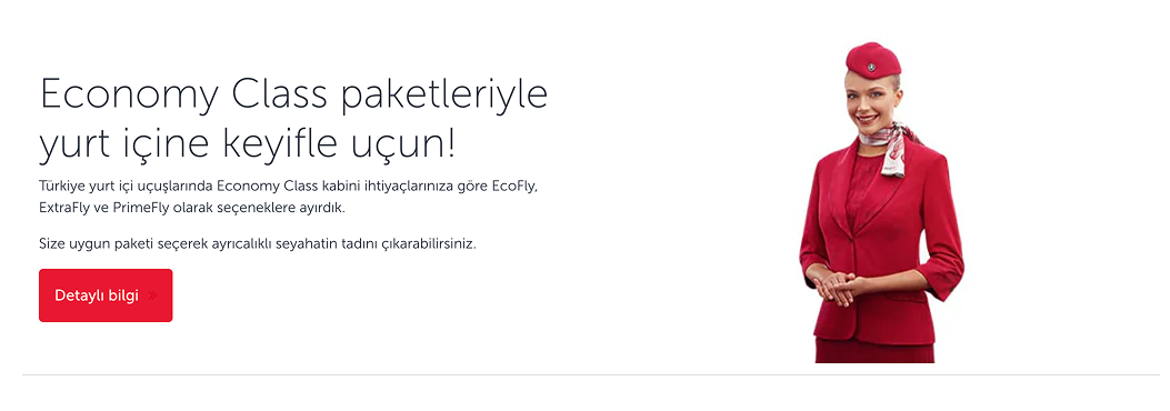
3.4.1. Keep human-centric imagery approach
Prefer authentic, diverse images of people that evoke emotion and connection over generic stock photos.

3.4.2. Use human images thoughtfully
If the person is the focal point of the image, ensure their face is never cropped at any screen size.
3.4.3. Align with personas
Use images that reflect Turkish Airlines’ target personas, as these represent our ideal passengers.
3.4.4. Privacy matters
Avoid images that focus on faces—especially children—unless you have clear rights and permissions.
3.4.5. Avoid cut-out images
Using people images without a background (like PNG files) can look odd depending on where they are placed on the website. Before adding any PNG image, ensure you know where it will be displayed. If uncertain, avoid using PNG images entirely.
3.5. Current and relevant Images
3.5.1. Use current images
When using images of cities, consider recent renovations or changes. An old image may make the content feel outdated.

3.5.2. Use updated logos
Logos are often updated for simplicity and modernity. Use only current versions to avoid an unprofessional appearance.

3.5.3. Choose understandable visuals
Select images that are easy to recognize. Avoid abstract visuals that require users to “guess” what they are looking at. Passengers should not have to decipher visuals like they would a piece of modern art.
3.5.4. Be careful with photoshop
Be cautious when you are adding our logo to stock images, especially those featuring outdated or unowned airplane models. Use visuals that reflect Turkish Airlines accurately.
3.6. Texts inside visuals
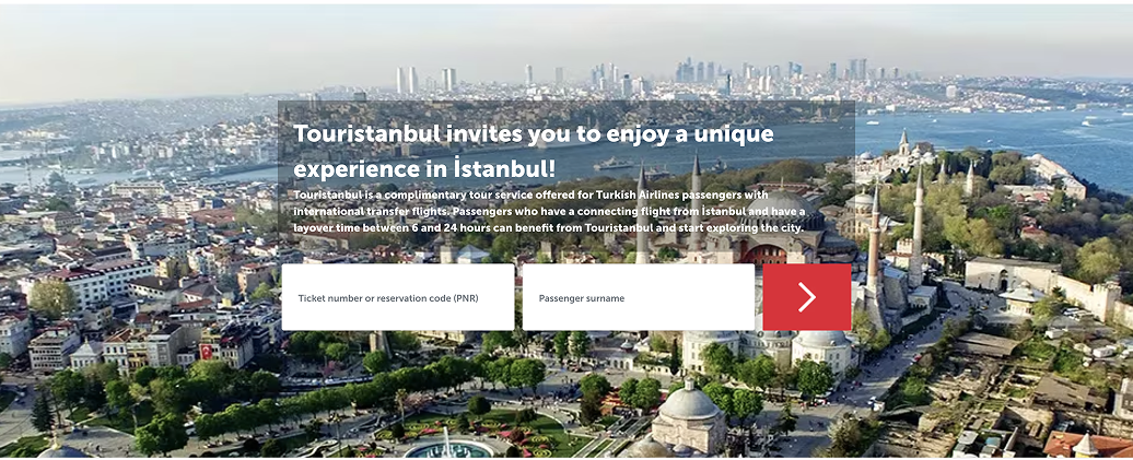
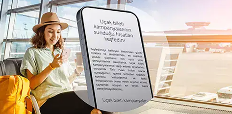
3.6.1. Avoid text-embedded images
Refrain from using photos that include text elements, such as posters, logos, badges, or any visuals with written content. Let the image speak for itself, and keep text within the design layout for clarity and flexibility.

3.6.2. Use punctuation carefully
Visuals with punctuation like percentages can be misinterpreted in different languages. Be mindful of international users.

3.6.3. Avoid embedding text in visuals
Embedding text within images affects resolution and makes translation difficult. Text should be separate from images to maintain clarity and adaptability.
4. Accessibility in visuals
4.1. Define text areas and ensure visual-text integration
When text overlaps with an image, the text becomes a visual element. Treat it accordingly to maintain readability and visual harmony.
4.2. Choose images that accommodate text areas
Ensure the background of text areas is simple, solid, and non-distracting to improve legibility. Collaborate with UI designers to achieve optimal contrast and clarity.
4.3. Visuals must support the underlying text
Images are not mere decoration. They should amplify the message and evoke the same emotions described in the text.
4.4. Images act as headlines
Users often skim content, relying on visuals as filters for relevance. Choose images that clearly support the headline and content.
4.5. Visualize what you can’t write
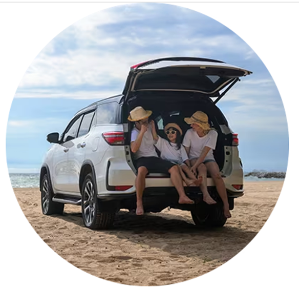
Instead of lengthy text, use visuals to convey key messages. For instance, a single image can depict a scenic beach better than a paragraph of description.
4.6. Avoid divisive imagery
Do not use visuals that might create social, cultural, or ideological division.
4.7. Be inclusive
Avoid visuals that can only be understood by a specific group. Inclusivity is essential.
4.8. Be aware of cultural sensitivities
Some images may evoke historical or cultural associations for specific groups. If you think an image might be sensitive, consult with colleagues or foreign team members for feedback.
4.9. Avoid humor in visuals
Humor varies across demographics. Visuals used for humor can be misunderstood, causing confusion. Keep it simple and direct.
4.10. Avoid disruptive visuals
Do not use visuals with jarring colors, strange facial expressions, sexual symbols, outdated objects, or anything that might provoke discomfort or disgust.
4.11. Avoid visuals that blend with backgrounds
Ensure a clear distinction between the visual’s area and clickable areas, preventing user confusion.
5. Text and visuals
5.1. Use alt text
To ensure accessibility for screen reader users, all images must have descriptive alt text. Here’s how to create an effective alt text:
- Be specific and clear – Describe what is most relevant and visible in the image.
- Keep it concise – Short and clear descriptions are best.
- Avoid unnecessary details – Focus on the essential elements.

5.2. Always name the image file properly
Passengers may want to download visuals we use. To maintain a professional and user-friendly approach, name the file appropriately. Here’s what to consider:
- Use underscores (_) instead of spaces.
- Name 2-3 main elements in the image.
- Include the theme.
- Add the image size.
- Consult with the SEO team if necessary.
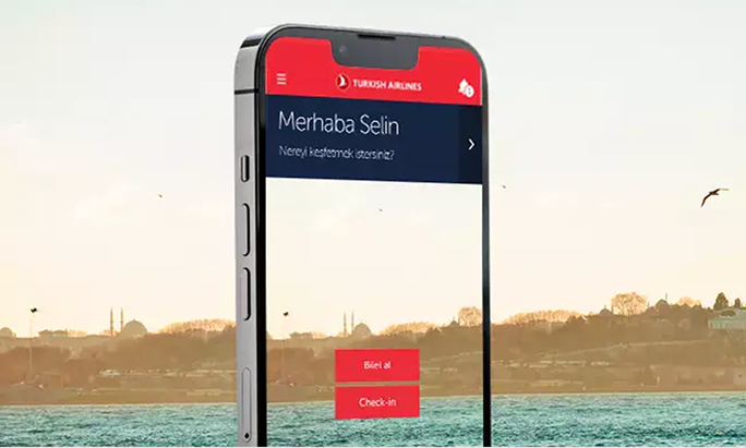
6. Mock-up for visuals
Sometimes, we may need to create mock-ups that display the app or website. Here are the key rules to follow:
6.1. Use high-resolution screens
Avoid using screenshots.
6.2. Ensure correct alignment
The content displayed on the device should fit perfectly without any shifts or misalignments.
6.3. Avoid filtered mock-ups
Using filtered mock-ups can make it difficult to match the same effect on the real interface.
6.4. Adjust the language for each version
We know it can be tedious, but ensure the mock-up text aligns with the language of the page. Otherwise, the visual loses its purpose.
6.5. Focus on readability
If the main focus of the visual is on the mock-up content, ensure it is large and clear enough to be read. Unreadable content only causes confusion.