Additional services
1. Introduction
1.1. What is the additional services to us?
In Horizon, additional services are more than just offerings; they are a reflection of how we communicate added value with clarity and purpose. These components provide passengers with essential options to enhance their journey while embodying our brand’s approachable and user-focused tone. They are crafted to align with our style guidelines, ensuring consistency, simplicity, and a natural flow within the overall content experience.
1.2. Why do we consider the additional services as a pattern?
We recognize additional services as a crucial content pattern because they standardize how we present optional offerings across various platforms. This approach allows us to maintain a unified voice, ensuring that passengers effortlessly understand and engage with these services. By treating additional services as a structured content pattern, we can deliver clear, concise, and hospitable messaging that enhances user satisfaction while staying true to our brand identity.
Important reminder
The anatomies you will see below are given mixed for mobile and digital mediums. Since we design responsively, we care mobile-first in design and act accordingly. Therefore, although the dimensions change, the structures are listed in a similar way.
2. Principles for additional services
2.1. Know your target audience
The target users of these pages are passengers who have already purchased their flight tickets. Therefore, avoid using a tone that feels like you are selling tickets. Instead, focus on services that enhance their travel experience.
2.2. Avoid overly promotional language
Highlight the advantages and opportunities we offer to our passengers without trying to “sell.”
2.3. Be clear and understandable
As always, ensure the content is easy to grasp. Keep your text as concise as possible and use simple language for clear explanations.
2.4. Make it appealing
For additional services like business upgrades that may not be essential, create a sense of desire without overwhelming or tiring the reader.
2.5. Emphasize needs
Additional services are often used by passengers based on specific needs. Highlight that we understand their unique requirements and offer exclusive options to meet them.
2.6. Focus on benefits, not features
Clearly communicate how the service will benefit the passenger, rather than listing technical features.
2.7. Use a friendly and supportive tone
Make the content feel welcoming and helpful, like a trusted travel companion just like our main tone of voice.
2.8. Provide context
Briefly explain why the additional service might be useful during their journey or trip.
2.9. Prioritize visual hierarchy
Use clear headings, bullet points, and spacing to guide readers’ attention to key information.
2.10. Align with the brand tone
Ensure the content reflects Turkish Airlines’ hospitable, professional, and globally recognized brand personality.
2.11. Address common concerns
Reassure passengers by addressing potential questions or hesitations they may have about using the service.
2.12. Incorporate actionable suggestions
Offer practical advice or solutions tied to the additional service, e.g., “Upgrade now to skip the check-in line!”
2.13. Avoid overloading with details
Provide only the essential information needed to understand the service. Include a link for further details if required.
2.14. Appeal to emotions
Create an emotional connection by highlighting comfort, convenience, or exclusivity. For instance, “Enjoy a worry-free journey with extra baggage allowance.”
2.15. Encourage exploration
Use language that subtly encourages users to discover and engage with more services.
3. Hierarchy and structure
Under which headings are additional services classified?
Turkish Airlines has made a name for itself globally due to its diverse range of services. The additional services that enhance the flight experience are structurally distinct. If you need to create content for an additional service, you must first understand its classification and content structure. Below are the details of informational and marketing-based classifications.
3.1. Information-based services
Some additional service experiences may require extensive input from travelers. As a result, travelers must carefully fill in data entry fields before completing their purchase. However, overwhelming users with questions too early in the process might deter them from completing their booking. For this reason, the following service pages are designed for informational purposes only:
- Traveling with pets
- Rent a car
- Hold the Price
3.1.1. What components are used on information-based services?
When creating an informational page, refer to the following guidelines to decide which components to use or avoid. Review these rules before creating a page or adding new components to an existing one.
- “Welcome info module” must always be placed below the banner image.
- To visually support the information provided, you can confidently use the “Triple cards”.
- To enhance the information with videos, use the Info module on top of the video.
- FAQs are mandatory. Ensure you pull from the general FAQ and display them here.
- For highlighting important and distinctive details, use the “Info box” component.
- If other services can be evaluated alongside this one, include a “Triple promotional cards” component.
- If you need to redirect users to other subpages, the “Dual cards” component is ideal.
3.2. Marketing-based services
Many additional services are marketing-oriented. If the user has a reservation or is purchasing services from Turkish Airlines’ partner companies, they can immediately buy these services. Since the user has the potential to purchase right away, the content on these pages should be marketing-focused. The following service pages are designed for marketing purposes:
- Turkish Airlines Lounge
- Sports equipment
- Seat selection
- Extra baggage
- Cabin upgrade
- Hotel booking
- XCover Travel Insurance
- UAE E-visa
3.2.1. What components are used on marketing-based services?
Refer to the following guidelines when creating a marketing page to determine which components to include or avoid. Review these rules before creating a page or adding new components to an existing one.
- Marketing pages must include a booker component. The booker’s purpose is to direct users toward purchasing the service quickly.
- “Welcome info module” must always be placed below the banner image.
- To visually support the information provided, use the “Single info module” or “Triple info module.”
- To enhance the information with videos, use the “Info module with video.”
- If you have multiple emotion-evoking photos and limited space, the “Carousel with heading” component is ideal.
- For highlighting important and distinctive details, use the “Info box” component.
- Use the “Triple cards” component without buttons to avoid distracting the user.
- If you must include buttons in the “Triple cards” component, ensure that the destination subpage only provides information. Confirm that the subpage includes a booker component.
4. Components in additional services
4.1. Booker or banner

4.1.1. Booker visual
Although additional services vary, they will be presented in a similar structure, so users will first encounter a visual.
- Since the visual is the primary element that signifies differentiation, users should feel where they are without needing to read the heading.
- The visual must communicate with the heading.
- Choose visuals that look appropriate for both web and mobile platforms.
- Ensure the focus area of the visual is outside the text field.
- For more suggestions, check out our content on visuals.
4.1.2. Booker heading
The first touchpoint for users in additional services.
- The heading for the additional service input field must explicitly state the name of the service.
- This rule may be adjusted only to meet SEO requirements. If the SEO team requests a different heading, remind them to achieve this using the fewest and simplest words.
- Headings should always be written in sentence case.
- For more tips, refer to the Headings section.
4.1.3. Booker input placeholder
hese texts provide hints about data entry fields before users take action.
- Additional service data entry fields may have varying structures.
- The hints must be short, clear, understandable, and usable.
- Please note that the content should not exceed 39 characters.
- Consider our tone of voice and user experience guidelines.
4.1.4. Booker prompt
Prompts are elements that complete the dynamic interaction of a field.
- Even if the same information is collected, prompts must differ in each scenario due to the principle of aligning with the heading.
- Express the action clearly, concisely, and inclusively.
- In the above example, the action is upgrading extra baggage, guiding the user to proceed after entering their information.
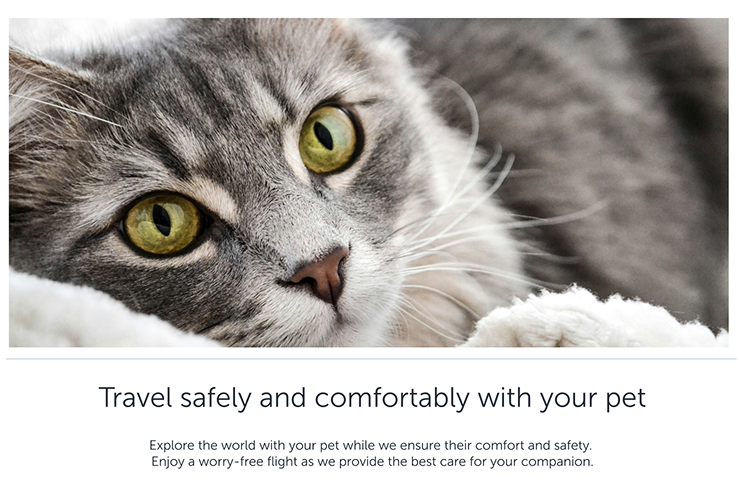
4.1.5. Banner heading
We can direct users to several subpages for booking or purchasing the service. In this case, we do not use any booker. We greet the user with a banner image and inform them about the service with the info module heading and description. For details about banner heading check the info module heading.
4.1.6. Banner description
Descriptions that will help with the banner image and heading are included in the banner component and are indispensable. A banner cannot be prepared without description. For other details and principles about banner description check the info module description.
4.2. Info module
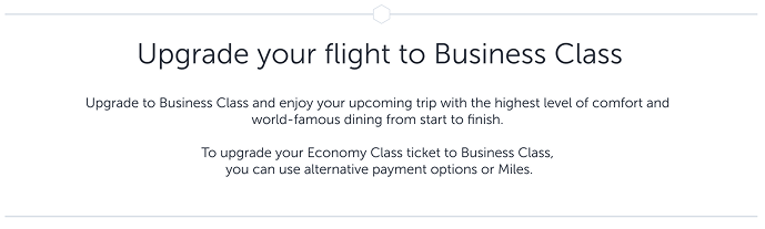
4.2.1. Heading
This module follows the data entry field. Its purpose is to explain how the user can benefit from the specific additional service.
- Use familiar words.
- Ensure that you provide a hint about the service.
- Write in sentence structure and avoid using periods.
- Refrain from asking questions.
- Avoid exclamation marks unless the situation genuinely calls for excitement.
- Aim for headings that do not exceed two lines on mobile devices. This effort will ensure a neat, easily scannable heading on the web version as well.
- Provide line breaks after conjunctions or commas and ensure each line retains scannability and meaning.
- Keep the heading within 40 characters.
4.2.2. Description
This label details why users should consider purchasing the service.
- You may adopt a marketing tone to highlight advantages and conveniences, but keep in mind that this is part of the user experience, not an advertisement.
- Focus on explaining how we enhance their lives and improve their flight experience, using specific examples rather than generic statements.
- You may write in an inspiring tone but avoid over-promoting the product. Highlight how this experience makes the user feel special.
- Remember that users visiting additional services have already purchased their tickets or made reservations. The goal here is to outline the benefits that improve their flight experience.
- Maintain a formal tone of voice—this does not mean being overly cold. Inspire confidence in the user and encourage them to imagine the benefits of this service.
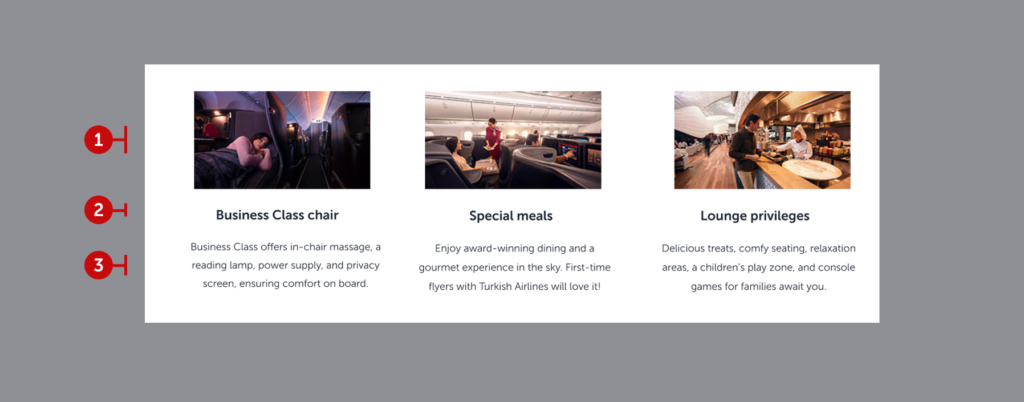
4.3. Triple cards (with or without prompt)
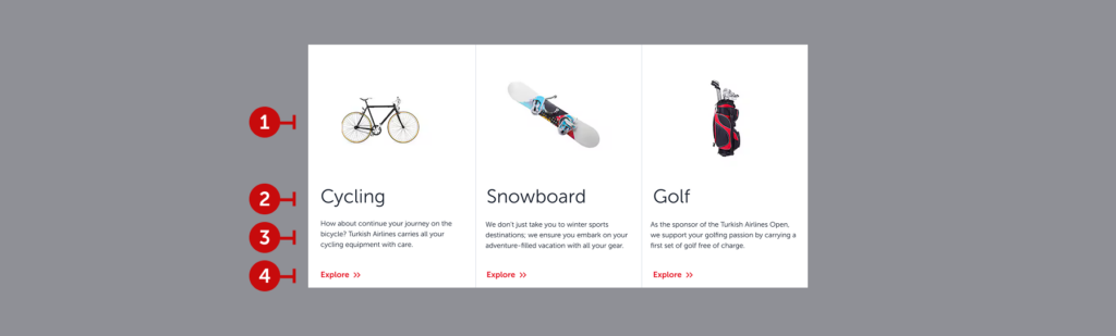

This component presents information on various topics in an integrated manner, highlights the benefits of an additional service as well. We aim that it can be worked with or without prompt according to the content designer’s needs.
4.3.1. Visuals
Choose images that allow users to understand the topic at a glance without needing the title or description.
- Ensure all images share the same visual style.
- Select visuals aligned with Turkish Airlines’ branding, if possible.
- Use the same size for all images in a row.
- Opt for clear and straightforward images rather than overly detailed ones.
4.3.2. Headings
Use the exact topic as the title.
- Focus on the sport’s name rather than the equipment, as rules and fees may vary by equipment within the same sport.
- Avoid full sentences or phrases; use concise noun phrases instead.
- If the title exceeds 16 characters, move to a second line, but try to keep it to one line when possible.
4.3.3. Description
Summarize the key information before directing users to the details.
- Reassure users, particularly when it comes to handling sensitive equipment.
- Incorporate specific information related to Turkish Airlines or the topic (e.g., referencing Turkish Airlines Open Golf Tournament to build trust).
- Limit the description to two sentences, not exceeding 4 lines or 200 characters.
4.3.4. Prompt
Use a button to guide users to the detailed information page.
- Ensure the text is action-oriented and meaningful when read independently.
- Keep it under 15 characters for readability across mobile and web.
- Indicate that detailed information is available on the next page.
4.4. Dual cards

This component structure is essential for information-based additional services. It leads the user to two different subpages with two different actions it offers. The example above is taken from the “Traveling with pets” service and as seen, it includes two different actions such as calculation and reservation.
The underlying reason of not being used in marketing-based content is to not lead the user to another subpage. When you need to offer services that will support the additional service, please use the “Triple promotional cards” structure.
4.4.1. Visual
These visuals will likely be provided by the agency, but if they are not:
a. Ensure the brand’s logo is displayed on the visual. This way, the visual acts as a headline and helps users quickly filter information visually.
- Ensure the brand’s logo is displayed on the visual. This way, the visual acts as a headline and helps users quickly filter information visually.
- Maintain a consistent visual style for all visuals on the page.
- Whenever possible, choose visuals that align with Turkish Airlines’ branding.
- Ensure all visuals in the same row are of equal size.
- Select clear and easily understandable visuals; avoid overly detailed images.
- For additional visual tips, refer to the “Visuals” page.
4.4.2. Heading
Create a catchy slogan that promotes the benefit you offer and encourages users to read further.
- Focus on the experience being offered rather than the product itself.
- Follow action-oriented approach and ensure that it speaks with the prompt.
- Write in sentence structure but avoid ending with punctuation.
- If the heading exceeds 30 characters, break it into two lines. However, it should not exceed 60 characters or two lines in total.
- If the heading spans two lines, ensure all headings on the page follow the same two-line structure.
4.4.3. Description
Write a short description that encourages users to visit the related website.
- While writing the description, think from the user’s perspective: “What would make me want to explore further?”
- Highlight benefits and unique advantages.
- Use a more polished and inspiring tone.
- Limit the description to a maximum of two sentences. Do not exceed 4 lines or 160 characters.
- Ensure all descriptions on the page follow the same line structure.
4.4.4. Prompt
Use a button to direct users to the related website.
- Always use action-oriented language.
- Keep it short to ensure readability on both mobile and web platforms. It should not exceed 15 characters.
- Ensure it makes sense for users who might only read the headline and the button together. The button should complement the headline.
- Indicate that all detailed information will be available on the linked website.
- Use commonly used phrases like “Explore”, “Discover”, or what the expected action is.
4.5. Single info module

This module provides indulgent information about the service. It appears in a single layout on the web and mobile.
4.5.1. Visual
Use images that align with the topic, band together with content, also comply with visual guidelines.
4.5.2. Heading
This heading should inspire user about the service, as it will not lead to any action. Please avoid over-marketing and over-creative headings. It will be enough to describe the quality of the service in an elegant way. Be careful not to exceed a single line and also 40 characters.
4.5.3. Description
Your heading has given an idea about the service. Now it’s time to provide the details. Complete the description without going into too much detail and by providing only the necessary information. Three short sentences are ideal for this section. Try not to exceed 220 characters and three lines.
4.5.4. Prompt
It’s not necessary to add a button here. But if you need to add a button please keep it simple. Use as less words possible. Tell actions instead of nouns. Try limit for 15 characters.
4.6. Info module on top of the video
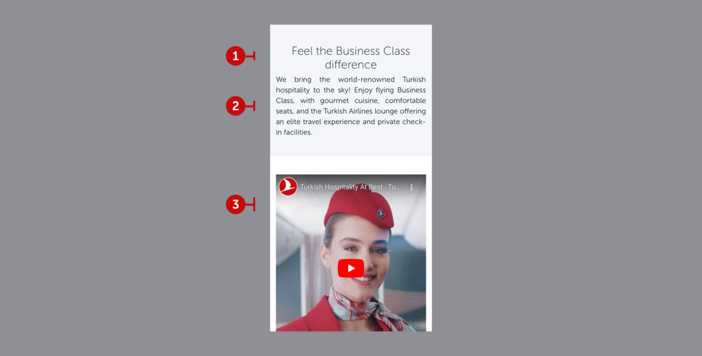
The rules are the same as those for the Info Module. When you are adding a video component you need to add a supporting info module on top of the video.
4.6.1. Heading
Choose a heading that aligns with the video. Keep the heading under 45 characters and two lines. Write in sentence structure. If the component does not end with an interaction, use a noun phrase.
4.6.2. Description
Prepare a description that complements the video. Do not exceed 180 characters for four lines. Reflect the main idea and emotion of the video in the description.
4.6.3. Visual
The relevant team will place the associated service video. There are no specific content rules.
4.7. FAQ
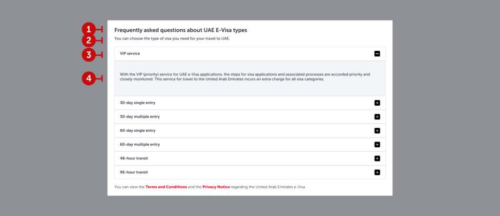
This component presents information on various topics in an integrated way, making it easy for users to access only the information they are interested in.
4.7.1. Headings
Summarize the content of the dropdown as briefly as possible (preferably in 2-3 words) using a noun phrase.
4.7.2. Description
Provide a concise summary of what is covered in the dropdown. Users should understand what they’ll find here just by reading the heading and description. Keep both as short and clear as possible.
4.7.3. Dropdown Headings
Unlike FAQs, use noun phrases instead of complete sentences. The goal is to help users quickly identify their needed section at a glance.
4.7.4. Dropdown Descriptions
Clearly present the section’s content without redirecting users to another page. Use simple language, and if the content exceeds a paragraph, include a “Read More” option. The first paragraph should summarize the entire content.
4.7.5. Hyperlinks (optional)
Use hyperlinks to direct users to detailed legal information if needed. See the “Links” section for more details.
4.8. Info box

Occasionally, it’s necessary to highlight and emphasize additional information directly on the page. Info boxes are highly functional in some scenarios. However, it can undermine the overall experience in some scenarios. For instance, if you need to add a privacy notice, you’d rather make them a part of FAQs.
In conclusion, if you have to use it, use it. If there is another way to provide information, do not use and implement the text into the related component.
4.8.1. Icon
The info icon’s design is determined by the visual team and is uniformly positioned in all boxes.
4.8.2. Text
There is no strict character limit, but the text should not exceed two or three sentences. For longer explanations, separate the information with bullet points to maintain readability. Keep the text within the suggested readability index for an effective info box.
4.9. Triple info module
This module provides additional information about the service. It appears in a triple layout on the web and as a slider carousel on mobile.
4.9.1. Visual
Since the visual size is limited, use simple visuals that convey the feeling. The user’s focus should remain on the heading and content. Avoid overloading the visual with excessive details.
4.9.2. Heading
State the privilege in two or three words. Write in sentence structure. This could either be a noun phrase or a verb phrase. For consistency, ensure all headings are either noun phrases or verb phrases. If using verb phrases, ensure there is an interaction (e.g., a button or hyperlink).
4.9.3. Description
Aim to write clearly and concisely. Avoid exceeding 180 characters for four lines. Provide line breaks after conjunctions or commas for proper formatting and easy scanning. Focus on highlighting advantages. Avoid sales and marketing language. Inspire the user.
4.10. Triple promotional cards

This area is designed to redirect users to our partner brands or sub-brands. Remember, these collaborations are made with the passengers’ comfort and advantages in mind. Avoid overt advertisements or heavy marketing language; instead, focus on the benefits and opportunities offered.
4.10.1. Visual
These visuals will likely be provided by the agency, but if they are not:
- Ensure the brand’s logo is displayed on the visual. This way, the visual acts as a headline and helps users quickly filter information visually.
- Maintain a consistent visual style for all visuals on the page.
- Whenever possible, choose visuals that align with Turkish Airlines’ red branding.
- Ensure all visuals in the same row are of equal size.
- Select clear and easily understandable visuals; avoid overly detailed images.
- For additional visual tips, refer to the “Visuals” page.
4.10.2. Headline
Create a catchy slogan that promotes the benefit you offer and encourages users to read further.
- Focus on the experience being offered rather than the product itself.
- Write in sentence structure but avoid ending with punctuation.
- If the headline exceeds 30 characters, break it into two lines. However, it should not exceed 60 characters or two lines in total.
- If the headline spans two lines, ensure all headlines on the page follow the same two-line structure.
4.10.3. Description
Write a short description that encourages users to visit the related website.
- While writing the description, think from the user’s perspective: “What would make me want to explore further?”Highlight benefits and unique advantages.
- Use a more polished and promotional tone.
- Limit the description to a maximum of two sentences. Do not exceed 4 lines or 160 characters.
4.10.4. Prompt
Use a button to direct users to the related website.
- Always use action-oriented language.
- Keep it short to ensure readability on both mobile and web platforms. It should not exceed 15 characters.
- Ensure it makes sense for users who might only read the headline and the button together. The button should complement the headline.
- Indicate that all detailed information will be available on the linked website.
- Use commonly used phrases like “Explore”, “Discover”, or what the expected action is.