Announcements
1. Introduction
1.1. What do we mean by announcements?
Announcements are patterns we use to share urgent, unforeseen events, developments at airports in Istanbul and other destinations we fly to, as well as the latest updates about Turkish Airlines with our users. They come in different formats and are classified hierarchically based on their structure.
1.2. What are announcement hierarchies?
We classify announcements to know how to respond based on the type of event or situation, creating a unified system that everyone working with the content can follow. Announcements are categorized into three levels, ranked from the most critical (primary) to less urgent (secondary and tertiary). Let’s quickly explore these structures.
2. General principles
2.1. Use active voice
Maintain an active voice to keep the message direct and assertive, ensuring the message is straightforward. And also it needs to be easy to follow.
2.2. Be clear
Announcements should be short, precise, and easy to read. Avoid unnecessary words that could confuse the user.
2.3. Ensure clarity and avoid ambiguity
Use simple, straightforward language. Avoid synonyms or phrases that could be misunderstood or misinterpreted.
2.4. Minimize use of punctuation
Avoid using excessive punctuation that can disrupt readability. Refrain from using exclamation points to maintain a calm and professional tone.
2.5. Use hyperlinks carefully
Don’t place a hyperlink right above a button. Only link to the name of the destination page. Avoid structures like “Go here” – instead, name the destination page directly.
Get detailed information about flight cancelations, click here.
By clicking here, you can get detailed information about flight cancelations.
Get detailed information about flight cancelations.
2.6. Write concisely
Express yourself using the fewest possible words.
2.7. Stick to objective statements
Be informative. Convey the facts without adding opinions or emotions.
2.8. Use noun-based titles
Ensure that the user can understand the main point by just reading the title, without needing to go through the body text.
2.9. Descriptions
After providing the essential information, stop writing. No jokes—seriously. End the description. If more details are needed, direct users to a detailed page via a hyperlink. This type of content is meant to quickly deliver important information to users.
2.10. List view
In some cases, you may need to use bullet points. If you have more than three related items, transform them into a list to improve readability and scannability.
2.11. Use related cards
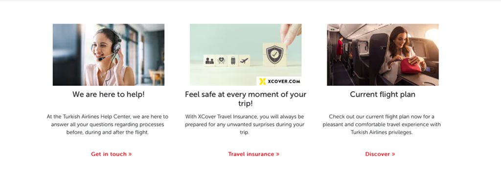
In the announcement subpage, ensure the content of the cards continues the user’s journey and ties in with the announcements. Put yourself in their shoes. Imagine you’ve just reviewed the announcements and scrolled down. What would you expect to see next? The Help Center, chatbot, travel insurance, flight routes… Think about your personas and when they might see these announcements, then arrange the layout accordingly. Remember, user testing is always the best way to validate your assumptions.
3. Types of announcements
3.1. Primary announcements
3.1.1. Crisis announcements
We use this structure for major events affecting one or more cities, such as large earthquakes, crashes, terrorist attacks, airport fires, or explosions.
In these cases, we remove the visual on the welcoming carousel and replace it with a one-sentence notification about the crisis. Use this template for sorrowful events that directly affect a large number of people. Also you would prefer it for the situations if government declares a national mourning. The message you prepare should reflect this sensitivity.
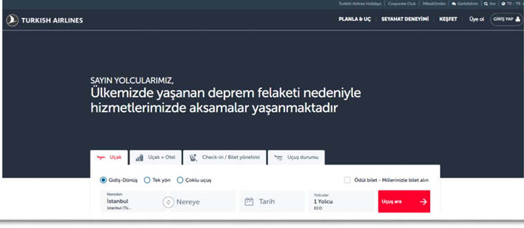
3.1.2. Emergency announcements
Used for unforeseen circumstances that disrupt the experiences of some users, such as flight cancellations, delays, etc. Although these are of primary importance, the product can continue to function normally. Therefore, they are designed as banners and remain on the page until the user takes action or the situation is resolved.
3.2. Secondary announcements
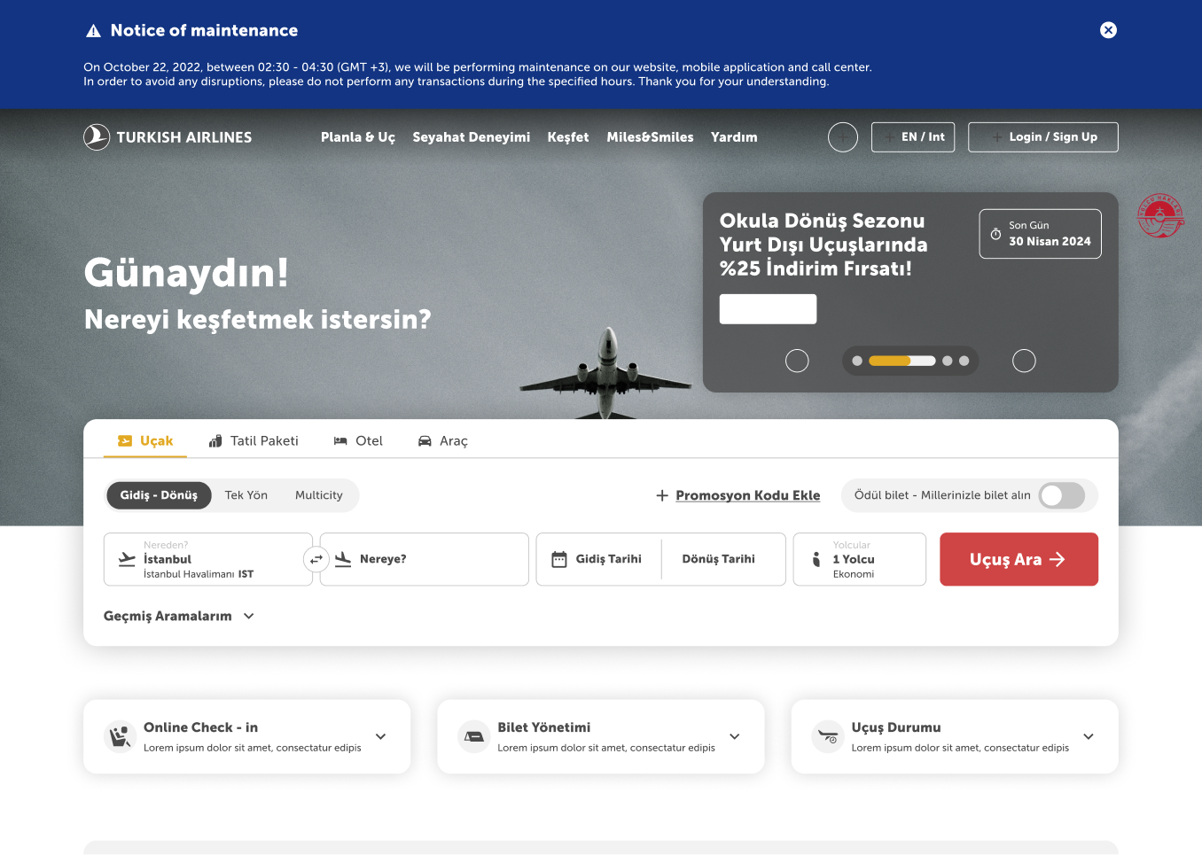
3.2.1. Planned maintenance announcements
Used for planned disruptions that may affect the experiences of some users, such as full or partial maintenance. Since these are of secondary importance, the product can continue as usual.
These announcements are also designed as banners and remain on the page until the user takes action or the situation is resolved.
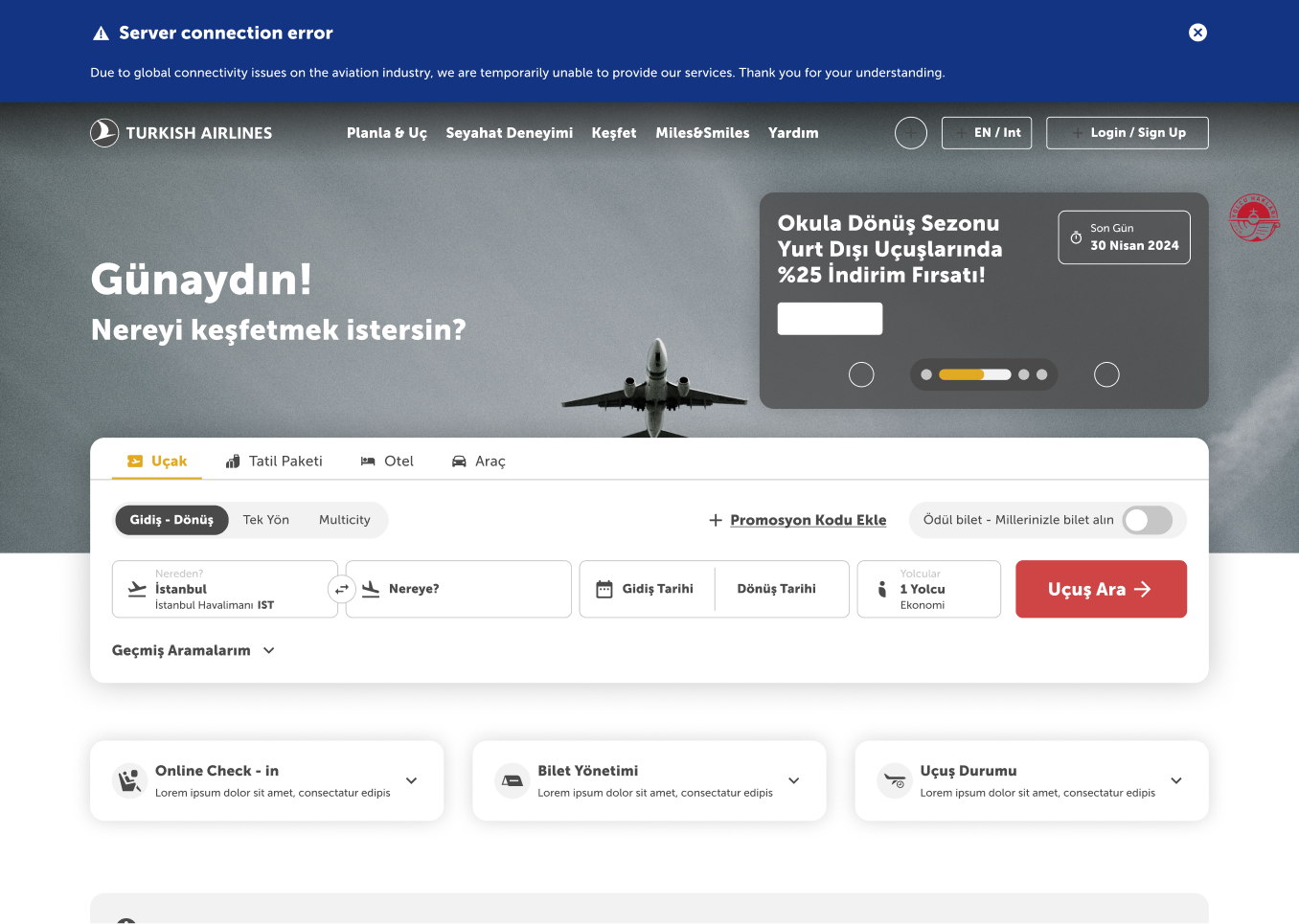
3.2.2. Unforeseen connectivity issues announcements
Used for unforeseen circumstances that disrupt user experiences, such as national or international internet outages or disruptions in Turkish Airlines systems.
These, too, are of secondary importance, so the product can function normally. They are presented in a banner format and stay on the page until the user takes action or the issue is resolved.
3.3. Tertiary announcements
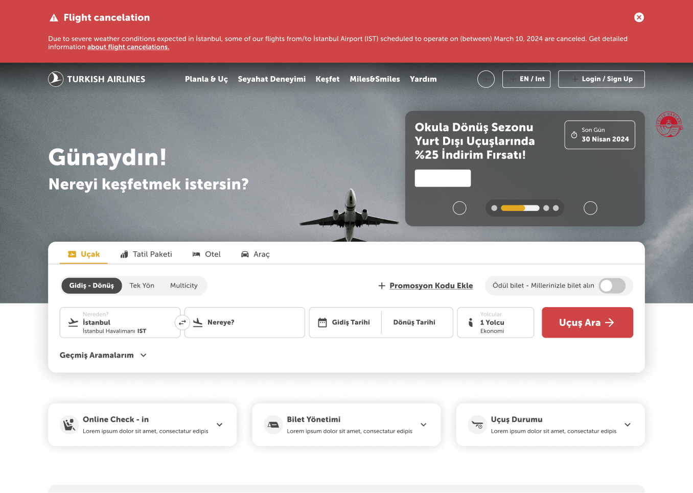
3.3.1. Airport announcements
Used for unforeseen circumstances that disrupt user experiences, such as flight cancellations, delays, etc.
This component is located on the homepage. These types of announcements also appear on the “Announcements” subpage accessed from the mega menu.
Although the user can continue using the site normally, they cannot dismiss the announcement.
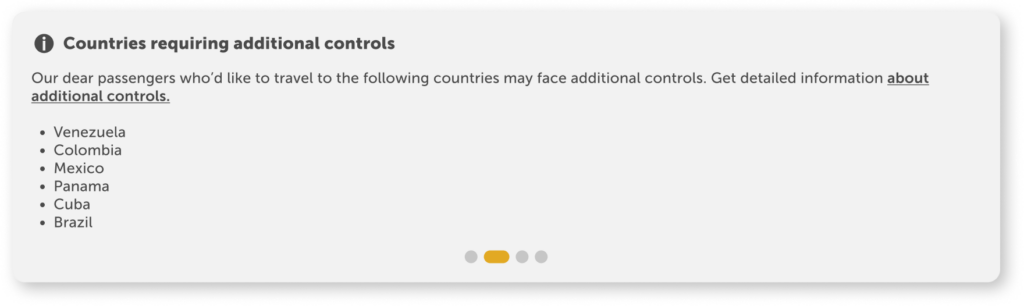
Title: A noun phrase describing the situation should be preferred. It should not contain any action.
Description: A single sentence should explain the situation, with a hyperlink directing users to more details.
When you need to provide more than three set of information, do not write them into the sentences. Always go for the listing method.
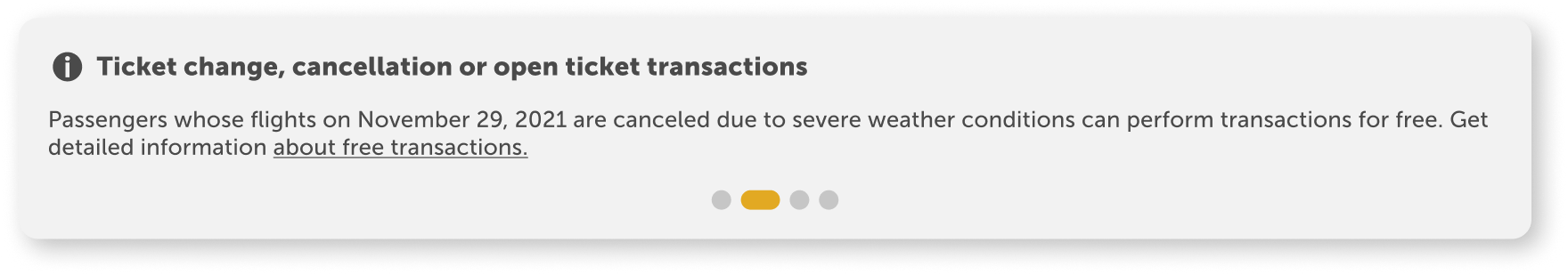
3.3.2. Cancellation / Change / Open ticket announcements
These are used to inform passengers affected by unforeseen flight cancellations about their rights for cancellations, changes, or open tickets.
This component is located on the homepage. These types of announcements also appear on the “Announcements” subpage accessed from the mega menu.
Although the user can continue using the site normally, they cannot dismiss the announcement.
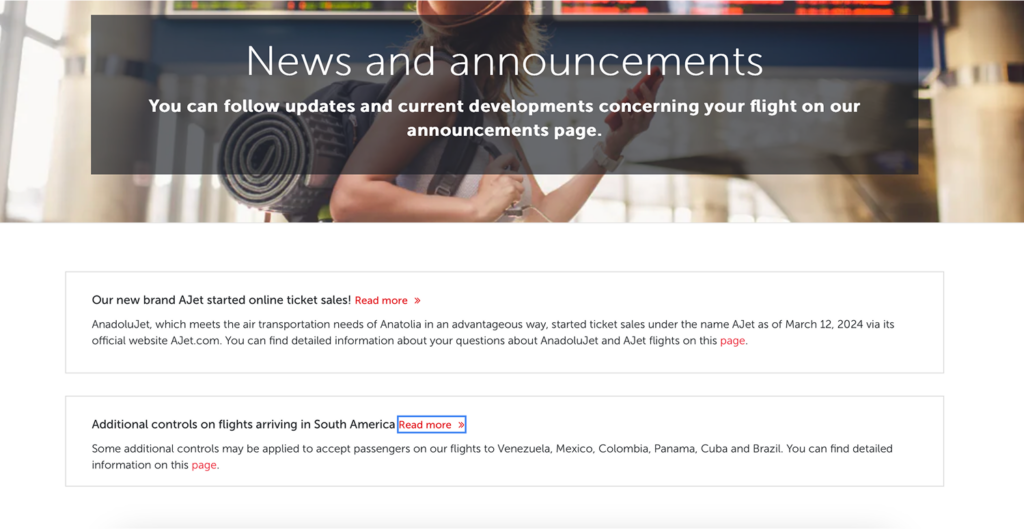
4. All announcements subpage
4.1. Page anatomy
Announcements are listed after the welcoming carousel banner. At the bottom, we include card structures that may be relevant to the announcements, allowing the user to easily access content they are likely to search for next.
4.2. Sorting criteria
The announcements listed here are not arranged by importance. The most recent entry is always displayed at the top.
4.3. Component
Announcement components are designed as interactive dropdown. Only the titles are visible, and the dropdown is closed by default. A “Read more” button is placed to encourage users to read the announcement. Each announcement contains a hyperlink at the end, directing the user to a detailed page.