App Stories
1. Introduction
1.1. What does “App stories” mean to us?
The App Story feature serves as a dynamic space to connect with users by delivering engaging, clear, and visually appealing content. From company updates to additional services, each story should be tailored to capture the user’s attention and communicate key information effectively. By following a consistent and user-centric approach, the content can ensure clarity, evoke interest, and encourage users to take action.,
This guide outlines essential principles and patterns to craft stories that align with our brand identity. Whether you’re introducing a new feature, announcing updates, or sharing helpful tips, the focus should always be on concise language, compelling visuals, and a seamless user experience. By maintaining consistency and creativity, we ensure that every story adds value to the user journey.
We take app stories under two headings: type and style. Let’s dive in together.
2. Categories
2.1. Campagin
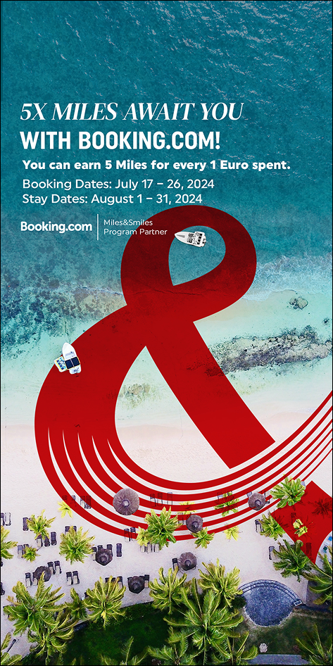
When writing campaign texts, remember to spark excitement. The content should make users feel eager and highlight the advantages they’ll gain. The reader of this text should feel compelled not to miss this opportunity.
Use clear and straightforward expressions. Explain in the simplest terms what action will lead to what outcome, and clearly highlight the benefit the user will gain from it. Essential details, such as the campaign’s validity dates, should be presented in an easily readable format. If there are partners involved, their logos or names should be clearly visible. However, if you use the logo, there’s no need to mention the name again within the text.
2.1.1. Heading
- Keep it within 55 characters and no more than two lines.
- You can use a slogan here.
- Avoid ending the sentence with a period. However, exclamation marks, question marks, or ellipses are acceptable.
- For aesthetic purposes, and as long as it doesn’t distort meaning or lead to misunderstandings, you can use fragmented or inverted sentences.
2.1.2. Description
- Do not exceed four lines.
- Clearly and explicitly state the detailed data related to the campaign.
- You can use punctuation marks to write more concisely.
- Aim to write as little as possible, and try to eliminate unnecessary conjunctions.
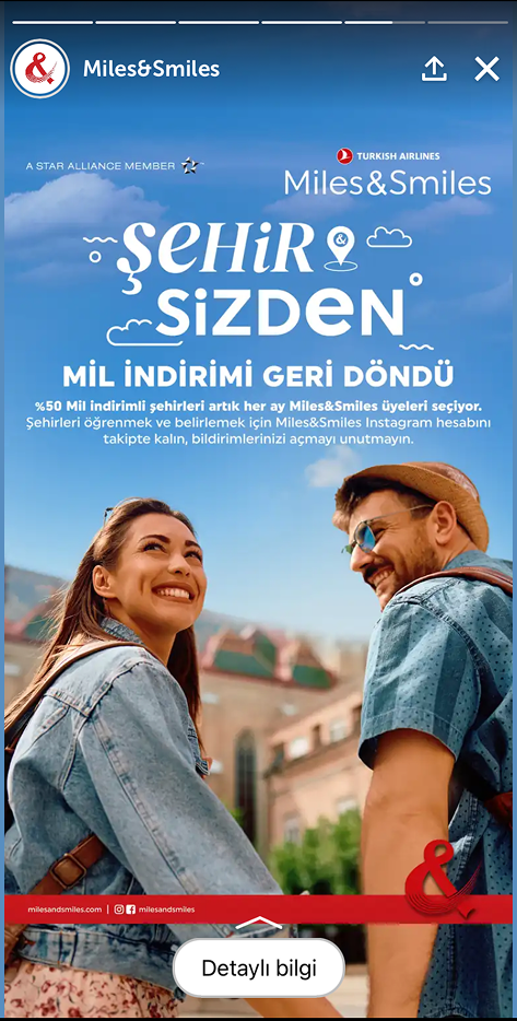
2.2. Holidays
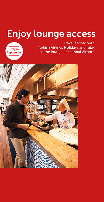
For the app stories promoting Holidays, our sub-brand, the aim is to market it effectively and familiarize users with Holidays. Therefore, all the content written here can use a marketing tone. Introduce users to the comfortable and advantageous world that Holidays offers. Our passengers are so important to us that we strive to make not only their travels but their entire vacations as comfortable as possible.
2.2.1. Heading
Do not exceed 26 characters and two lines. It should summarize the entire content you wish to convey.
2.2.2. Description
Do not exceed four lines. Express what you want to say in one or two sentences. Write content that matches the visuals (or choose visuals that match the text). The heading, visual, and description must always complement each other.
2.2.3. Additional Data
If you need to share important additional information, you can use speech bubbles or other visual elements from the guide. Ensure it doesn’t exceed 3–4 words.
2.3. Blog
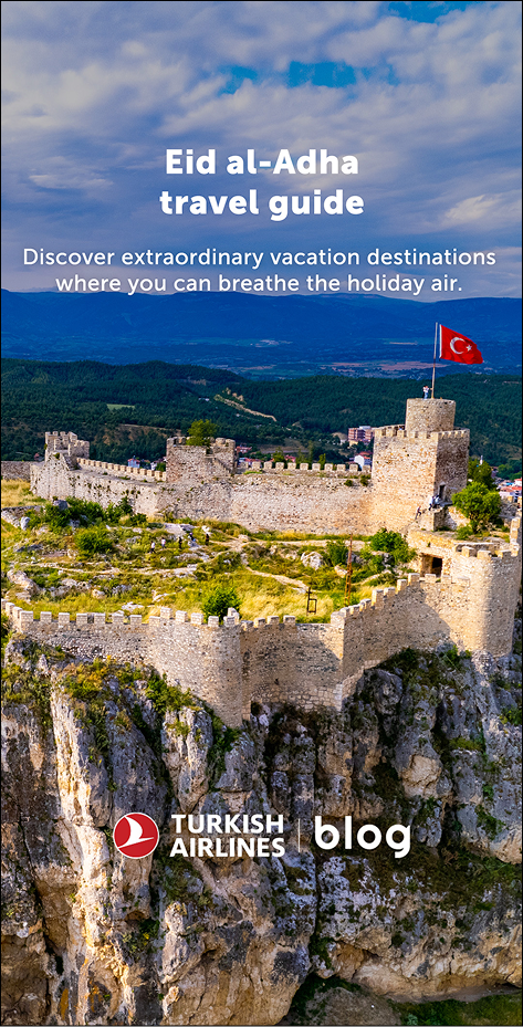
2.3.1. Title
- Do not exceed two lines. b. You can directly use the blog title, but if it’s too long, select a few key words that explain the main idea.
2.3.2. Description
- Write no more than two lines and one sentence.
- Describe the blog content in a way that sparks curiosity.
- Align the text and content with the visuals.
2.4. Announcement
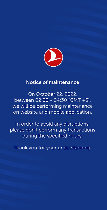
2.4.1. Blue announcements
We are using these kinds of announcements when there is planned maintenance or any other planned activity that will effect our online channels.
- Explain the main reason and outcome in plain language without diving into technical details.
- Give direct information.
- Summarize the issue in the heading with 3–4 words (avoid generic phrases like “Dear passengers”).
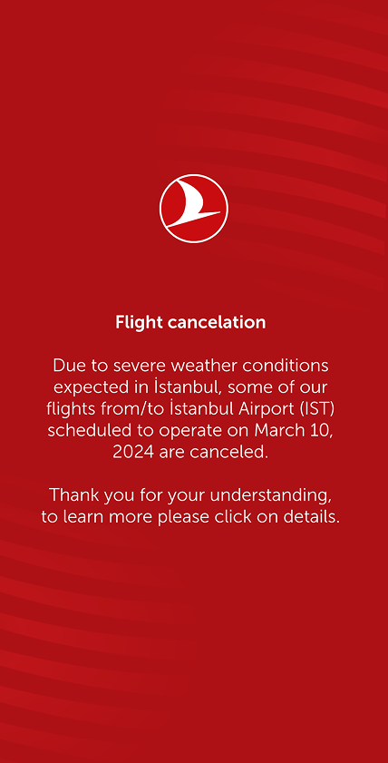
2.4.2. Red announcements
These are used for situations where no fatalities have occurred, such as flight delays, technical issues with the website, or hacking incidents.
- Explain the reason and outcome in plain language without diving into technical details.
- Show empathy and demonstrate that you share the concern.
- Mention the solutions or compensatory gestures you’ve planned for the issue.
- Summarize the issue in the heading with 3–4 words (avoid generic phrases like “Dear passengers”).
- If using buttons, align them with the heading and emphasize the next step (e.g., Discover, Learn, Read).
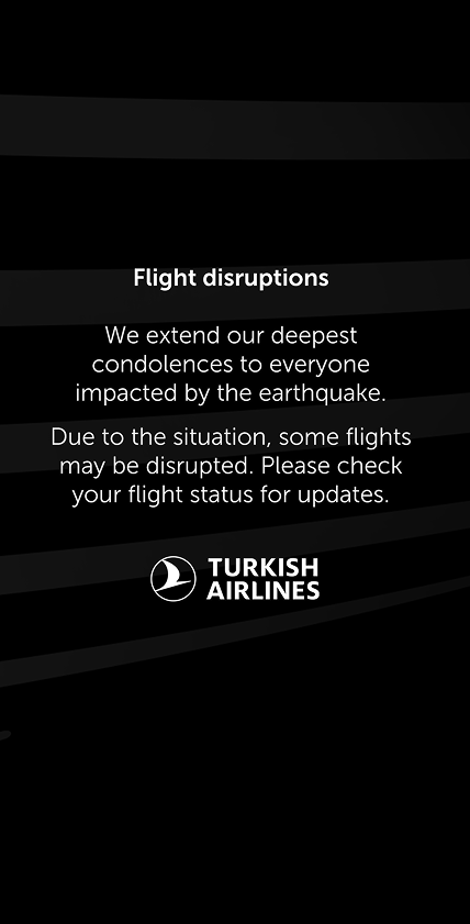
2.4.3. Black announcements
These are used for announcements associated with natural disasters, mourning, or other tragic events.
- Begin by expressing your well wishes.
- Show that you share the same sorrow.
- Briefly mention any special actions taken for the situation, and if applicable, provide further details via a link to another page.
2.5. News
Under the “News” section, include updates from our company. These can range from new flight routes to policy updates and any information that can be considered newsworthy. While not all news may seem captivating, it is our responsibility to make these stories engaging for our audience.
2.5.1. Title
Clearly convey the news in the title. Depending on the need, you may use either a subheading-heading structure or just a heading. Regardless of the style, ensure that all titles under the News section are concise and reflect the entire story for easy comprehension.
2.5.2. Description
Keep this part as brief as possible. Remember, a story’s view duration is no more than 10 seconds. Provide content that can be consumed within this timeframe. Prioritize the most exciting or significant aspects of the news when crafting the description.
2.6. Additional services
This section includes news, campaigns, updates, and similar content related to additional services. Use marketing language to encourage users to explore the content further. The tone should be simple, engaging, and easy to understand. Avoid repetitive wording in titles and descriptions.
2.6.1. Başlık
Clearly describe the content. The styles you use may vary based on the need, and you can refer to section 3. Styles for specific guidelines. Use straightforward language that encourages quick action.
2.6.2. Description
Strive to write brief and easily comprehensible descriptions. Express the full content with a minimum number of words.
2.7. Miles & Smiles
We do not define a strict style here. Instead, we work in alignment with the corporate identity of Miles&Smiles. The Miles&Smiles team clearly communicates their specific needs to us. Your role is to review the texts provided by them in accordance with Grammar and usage guidelines, making corrections where necessary. If visuals are supplied by their team, you can request revisions based on the Visuals document.
3. Styles
3.1. Curve box
3.1.1. Just heading

- Visual: Select a visual that relates to the content. Please check visuals before choosing one.
- Heading: Limit the heading to 40 characters, 2 lines, and no more than 4–5 words. Capture the core message.
- Description: Write no more than 4 lines. Provide additional details about the content, emphasize advantages, and evoke excitement.
- Prompt: The call-to-action button must align with the heading and direct users appropriately to the corresponding page.
When you are writing prompt, you need to know what will happen after users click the prompt. It can’t be the same prompt when you are directing reservation page or information page.
3.1.2 Main heading and sub heading
- Visual: Select a visual that complements the content. Verify its suitability. Please check visuals before choosing one.
- Supportive heading: Limit to 38 characters. The combined length of the supportive heading and headline should not exceed 4 lines. You can arrange them in 2–2, 1–3, or 3–1 combinations. Ensure it complements the headline and never stands alone. Use noun phrases where appropriate.
- Heading: Limit the headline to 22 characters and 2 lines. This is the primary focus of the page and should clearly convey the main topic.
- Description: Write no more than 4 lines. Avoid lengthy content, as it may deter readers. Keep it as concise as possible and avoid repeating words or phrases from the headings.
- Prompt: Ensure the button aligns with the heading and directs users to the relevant page.
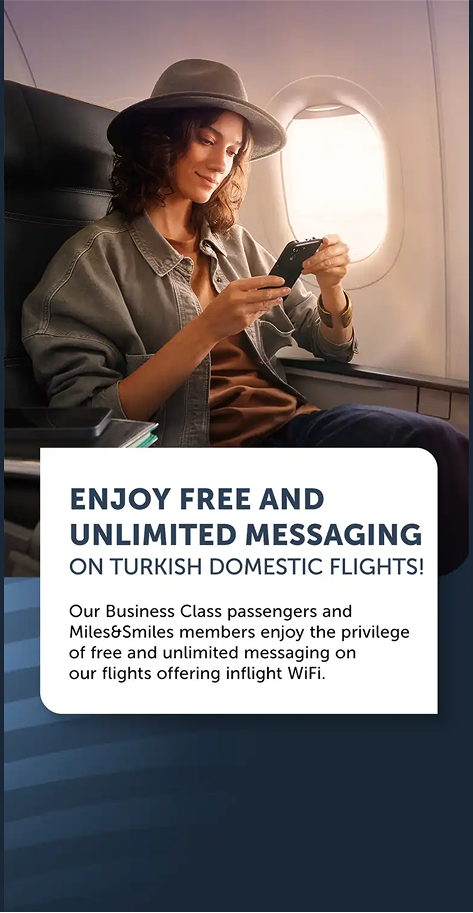
1- First of all it’s too long.
2- When you read it you feel like you gonna start free texting immediately, but unfortunately you are not.
3- Not giving the business class vibe in the first place.
1- Cuz it’s short.
2- It’s clear which makes it easier to read.
3- They easily understand where they can find free wifi.
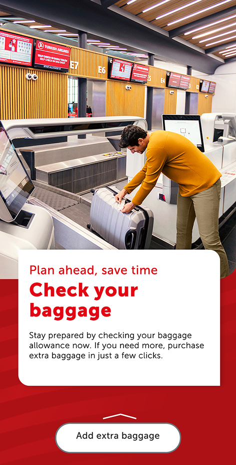
3.2 Standard background with visuals

This type can either accompany the curve box or stand alone, without altering the writing rules. Since it provides a slightly larger area, it allows for slightly longer text. However, all rules outlined under the curve box still apply.
- Visual: Do not exceed 2 lines of text for visuals.
- Supportive heading: Limit to 44 characters, 5–6 words, and no more than 2 lines.
- Heading: Limit to 30 characters, 3–4 words, and no more than 2 lines.
- Description: Limit to 140 characters, 2 sentences, and no more than 3 lines.
- Prompt: Ensure alignment with the heading and provide clear navigation to the target page.
4. Concept development
4.1. How to develop a new concept?
When working on new content that hasn’t been developed before, follow these guidelines to establish a consistent and reusable structure:
4.1.1. Pattern creation
- Analyze the new content and align it with an existing pattern whenever possible.
- If no suitable pattern exists, create a new one that can serve as a framework for similar future content. Aim to build a content family rather than a one-off piece.
4.1.2. Style selection
- Determine whether an existing style is appropriate or if a new style needs to be created.
- Refer to 3. Styles for guidance on available style options and their applications.
4.1.3. Visual and text area definition
- Decide on the visual elements (e.g., images, icons) and the allocation of text space. Ensure the visuals complement the written content and enhance clarity.
- Use the Visuals section as a reference to ensure your selections align with our standards.
4.1.4. Conceptual framework
- Place your content within a clearly defined concept. Identify its purpose, target audience, and key message.
4.1.5. Communication tone
- Establish the tone of communication based on the content’s purpose.
- For promotional content, use an engaging and action-oriented tone; for informational content, prioritize clarity and simplicity.
4.1.6. Visual language
- Decide on the visual language, ensuring it aligns with the tone and message of the content.
- Maintain consistency with our design system to reinforce brand identity.
4.1.7. Test for scalability
- Before finalizing the content, consider whether it can accommodate potential future additions in the same category.
- Ensure the framework allows flexibility without compromising consistency.
4.1.8. Review and refine
- Collaborate with design and UX teams to review the content.
- Refine any discrepancies in the visual and textual alignment to ensure a seamless user experience.
4.2. Why should you avoid using uppercase?
Using uppercase text might seem like a bold choice, but it often disrupts readability and user experience. Text in all uppercase makes it harder for users to recognize word shapes, slowing down reading speed and causing unnecessary eye strain.
Instead, opt for sentence or title case to maintain clarity and ensure a smoother reading flow. This not only improves accessibility but also helps convey tone more effectively without appearing overly harsh or monotonous.