Body Copy
1. What is body copy for us?
Body copy is the collective term that includes a heading and has the primary purpose of explaining that heading. They bridge the gap between the initial information a heading provides and the deeper understanding users need to complete tasks.
2. Different forms, different way of thinking
2.1. Paragraphs
Paragraphs are inherently encouraging to read. However, users tend to not respond to this type of reading encouragement. Therefore, we, as content designers, need to structure paragraphs in the shortest, clearest, most concise, plainest, and most understandable way possible.

2.2. Lists
User-friendly lists stand out for their ability to divide information on a logical level and be easily scanned. Sometimes not all information can be logically separated. In this case, paragraphs and lists should work together.
- Identify the important nuances in the topic you are explaining.
- Separate the nuances just like in this list you are reading.
- Position the separated nuances as a sentence or a heading.
And so the body text has become more airy and its readability score has increased. You can also check how you can measure the readability score.
3. Steps
Content design is generally about writing a story and taking users through certain steps in that story without them noticing. Think of level-based games. Without steps, we wouldn’t notice how far we’ve come.
- Think in a similar way when creating steps in a body text.
- Sometimes it may not be enough to convey the information to the user at the step they need in the simplest way possible.
- Providing a usage example will be beneficial to you in this case.
Let’s take a look at the body copies in component structures and check the principles mentioned above.
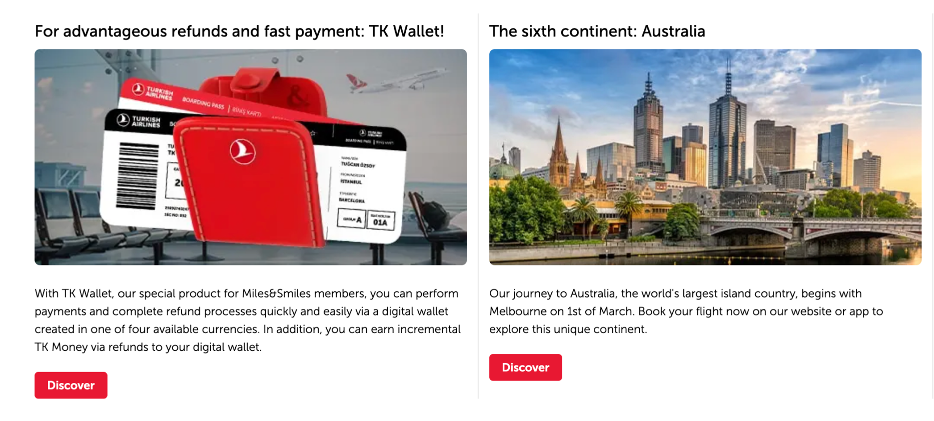
3.1. Announcements
Due to the complexity of our work, we often need to make announcements in various formats. The length of the topic being discussed and the space limitations of the component often prevent us from reflecting what we want in the interface.
Before start writing;
- Understand the topic first.
- Then, roughly draft and understand what you’re dealing with.
- Consolidate related information.
- Talk to the designer and ensure that the font size is readable.
- If you’re going to use hyperlinks, make them actionable.
4. Cards
The most effective components for placing body text are often cards. Let’s delve into the principles through examples.
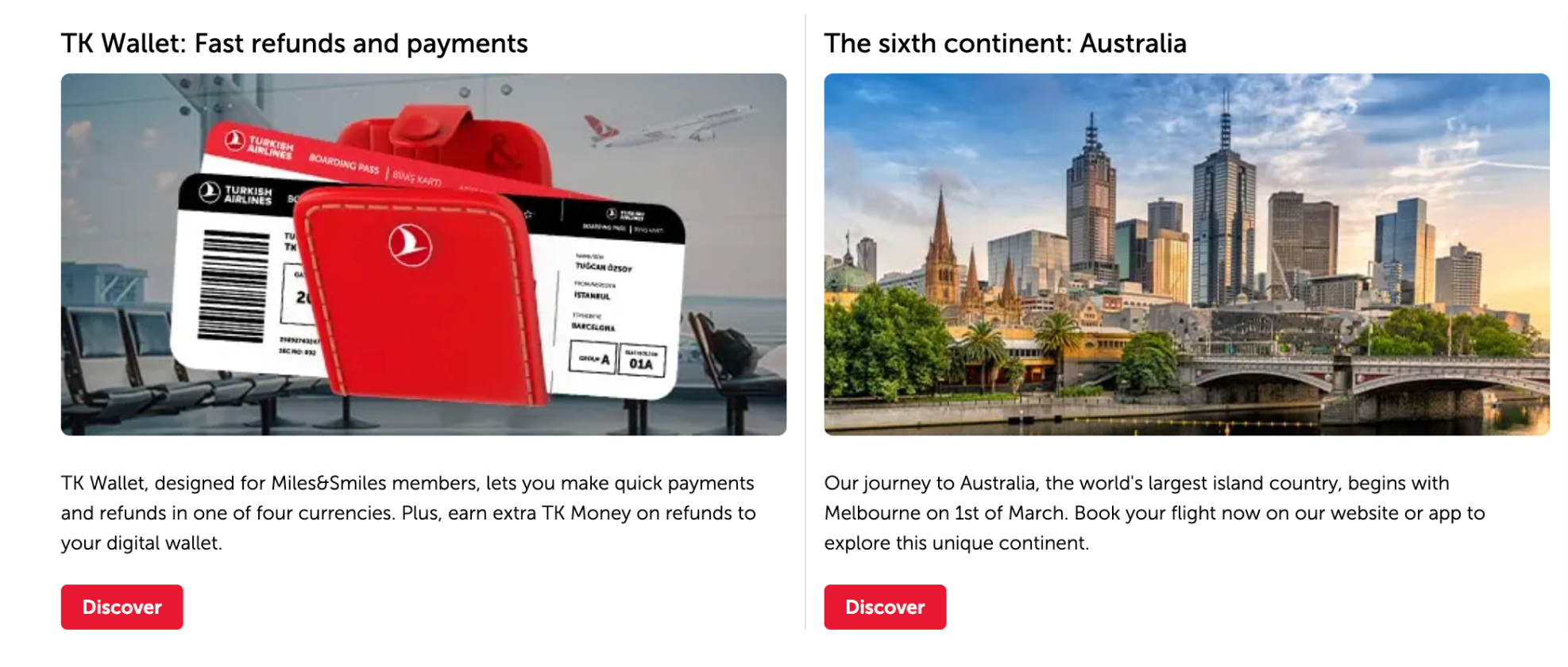
4.1. Slider cards
Slider cards are typically used to showcase offers and campaigns. We sense your creativity is ready to shine.
But before that, please check the following:
- Discuss with the designer whether the text should be aligned left or centered. Your design decision will affect the length of your body text.
- If readability is crucial, align the text to the left.
- If you want to grab the user’s attention, align to the center and accompany the title with an effective expression.
- Since cards are displayed side by side, strive to write different cards with the same number of lines.
- You have no character or word limit, but there’s no benefit in prolonging the topic. Give users what they need.

Do not exceed two or three lines in the body text of all slider cards.
Similarly, aim for one or two lines in the headings.
If there is a message on the image, do not repeat it in the text.
A prompt is as useful as it is simple. Simplify it.
4.2. Dual & Triple cards
In these structures, we describe the content of a service or the benefits of a product, and often rely on narratives enriched with photographs or icons.
- Due to the size of the cards, you may not always be able to opt for listing. Don’t worry. If you need to provide more than three pieces of information, direct the user to the card details.
- If you are providing three or fewer pieces of information, you can make a list. But after doing so, ensure that the text alignments are consistent with the adjacent card.
- If you need to write a paragraph, keep it to no more than two lines.
Limiting text to two lines might not work in all languages except Japanese. The most important thing to consider in this regard is consistency.
Ensure that the spacing between the body text and buttons is consistent. If one body text is a single line and another is four lines, there is a problem.
In this case, discuss with the product and design team to convey one of them in other component structure.
4.3. Outstanding & Wide cards
In these structures, having more space and broader areas for text design should not deceive you.
- Never shy away from clear, concise, and precise explanations. If the topic requires length, let it extend as a list.
- You can easily shorten paragraphs with some tricks. Avoid using the conjunction “and”. Sometimes, two short sentences are much more effective than one long sentence.


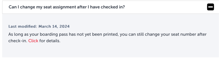
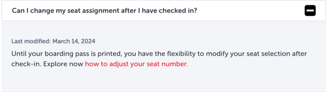
5. FAQs
It’s rare for body texts to deviate from the standard. The showcase may vary depending on the answer to the question.
- If the text becomes too lengthy, it creates readability issues. Divide the narrative into logical sections.
- Think about this way: would you prefer to listen to a topic presented in consecutive sentences or explained step by step? Probably the latter.
- Always prioritize listing long stories.
- Leaving a blank line between different pieces of information expands the space but also refreshes the narrative.
- Good UX storytelling isn’t about performing miracles in tight spaces; it’s about expanding the area. Components may be narrow, but your vision isn’t.
- Do not hesitate to make hyperlinks interact by using verbs into the underline.
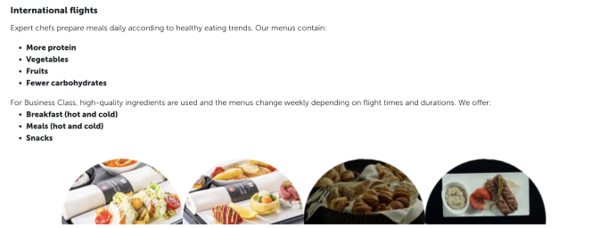
6. Charts
Body texts within charts, just like in FAQs, can often confront into longer explanations than expected. While resorting to listing within a chart might not seem straightforward, you can leverage your writing skills to create classifications that will give you an advantage.
- Understand the subject matter to be conveyed within the chart.
- If the subject contains more than three critical pieces of information, try creating list by using headings if needed.
- Write the headings in medium size font as the first sentence or use colons.
This way, you enable users to find what they’re searching for. Creating scannable text is the most ideal method for users who may not have as much time to delve into the topic as deeply as you have.
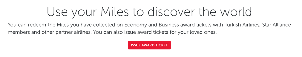
7. Banners
Banner components, another tool for presenting products and services, stand out with lifestyle photos. In structures where the photograph is such a hero, it poses a big issue to even read the heading because the photo usually narrates much of the subject matter. To ensure that the user doesn’t miss anything and doesn’t get scared when they view the body text, we recommend adopting the following principles.
7.1. Always create a container.
Containers placed on visuals are like miracles. If a banner will contain body text, talk to the designer and include it.
View the visuals section for details.
7.2. Exercise self-discipline and self-control when writing text.
Endless body texts are disturbing everywhere but ruin banners the most. It is not possible to set any character limit for body texts. However, it is not very difficult to determine the number of lines for the body text based on the size of your container and its position relative to the image.
- Don’t exceed two or three lines.
- Determine the number of lines for the body based on the number of lines in the title.
- The breakpoint where the sentence crosses to the next line is very important. For example, if the sentence (except for the beginnings) contains the conjunction “and” or “,”, it is meaningful to break the line from there.
- Strictly adhere to spelling and punctuation rules.
7.3. Don’t just provide information, be enticing.
Banners are structures where users usually read the title and button and take action. However, there will also be users interested in what you write. Think of them as superusers. They are listening to what you say. Adding a little flavor to your user-friendly writing can prevent them from being disappointed. View the marketing writing section for details.
7.4. Build a bridge between the title and the button.
A good body text complements the entire text structure from top to bottom. It ensures reading and understanding integrity. Think of this as a banner and all banners within Turkish Airlines. Can you provide consistency for all of them? Why not. If you need help, view the banner section in the components.

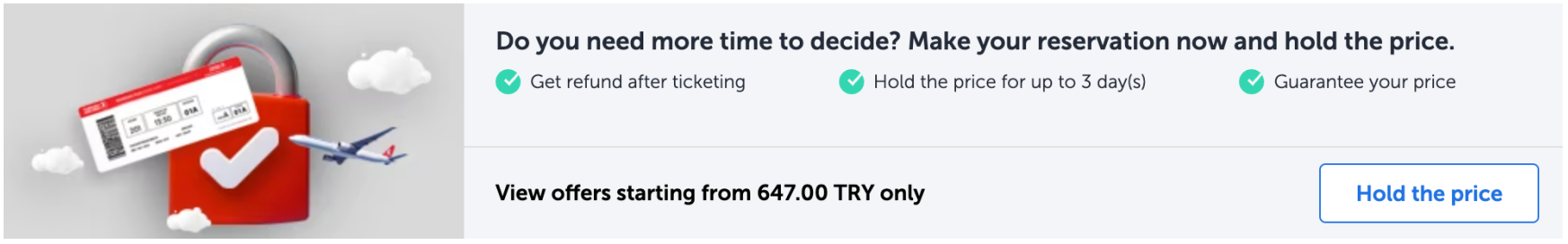
8. Dynamic components
Rest assured that in dynamic components, where you can find the most functional versions of body texts, you can express a subject in the clearest and most definitive way possible.
They are masterpieces in terms of description, information delivery, and guiding users to their goals efficiently.
So, how can you create a masterpiece?
- Be clear. What you have to say in these areas will already require clarity.
- Write in a way that is understandable to everyone, from 7 to 70.
- Allow the user to reach the button after a few seconds of scanning.
- Use definitive statements. Sometimes you can explain a complex topic. Don’t worry. Keep your sentences short. This way, the difficult story becomes easier on its own.
- Use accessible language. Your user base is very diverse. Make sure you address to everyone. You can find details about the tips for the accessibility.
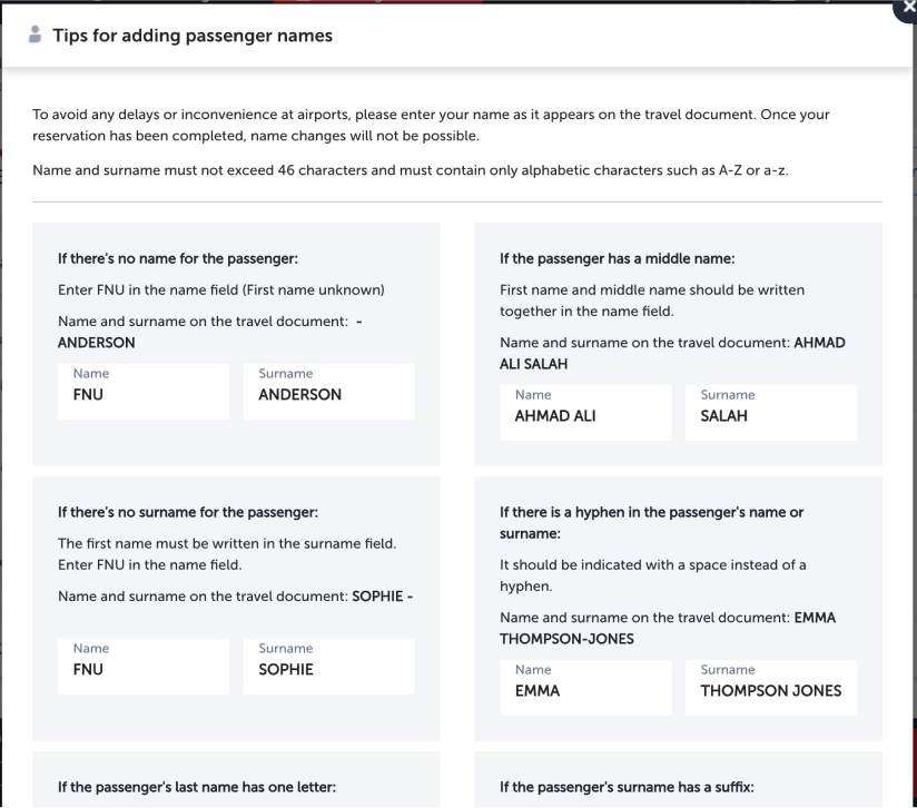
Let’s briefly look at the “dialogue boxes” and the “tips for adding names”.