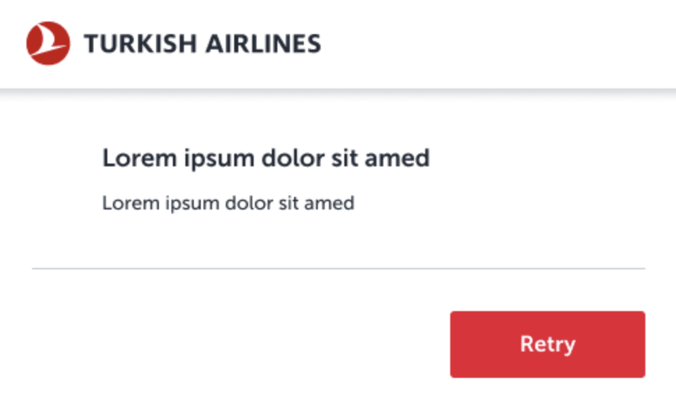
Error states
1. Introduction
Even when things go wrong, our tone, structure, and clarity should reflect Turkish Airlines’ values of hospitality, empathy, and reliability. Well-crafted error messages reassure users, reduce frustration, and guide them forward with confidence.
This guide outlines the key principles for writing error and warning messages, and provides examples for common scenarios.
2. Core principles
2.1. Don’t blame the user
Take ownership of the error whenever possible. If the error is due to the user’s actions, kindly indicate what happened without assigning blame, and provide clear instructions on the next steps.
2.2. Use active voice
Maintain an active voice to keep the message direct and assertive, ensuring the message is straightforward. And also it needs to be easy to follow.
2.3. Be concise and clear
Error messages should be short, precise, and easy to read. Avoid unnecessary words that could confuse the user.
2.4. Ensure clarity and avoid ambiguity
Use simple, straightforward language. Avoid synonyms or phrases that could be misunderstood or misinterpreted.
2.5. Align headings and buttons
The error message heading and the button text should be consistent and help the user understand what action to take next without reading the entire body text. The body should provide additional context if needed.
2.6. Minimize use of punctuation
Avoid using excessive punctuation that can disrupt readability. Refrain from using exclamation points to maintain a calm and professional tone.
3. Warning messages
Warnings inform users about potential issues or important information without indicating a critical error. They usually alert users to conditions that might require their attention or action but do not halt their progress entirely.
Since the user progress will not be stopped, you should give them prompt options (except validations).
3.1. Types of warning messages
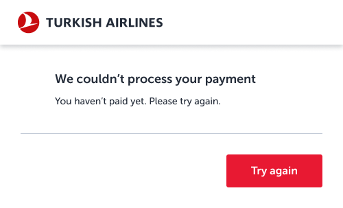
3.1. Errors regarding financial stuffs
Acknowledge the user’s concern clearly—especially around payment issues. Reassure them if no charges were made.

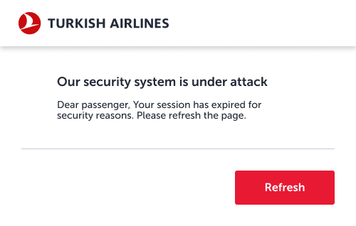
3.2. Technical errors
These errors occur due to technical issues. Even though we’ve experienced a technical issue, you do not have to use technical jargon, while tell the situation to our users. The user may experience security concerns related to an error. Allow them to pass this temporary issue by refreshing the page.

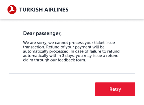
3.3. System errors
For system errors, avoid overwhelming the user with technical details. If data is available, explain the situation briefly and guide the user to retry.

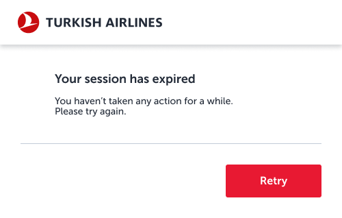
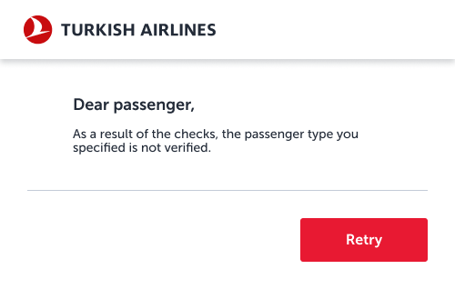
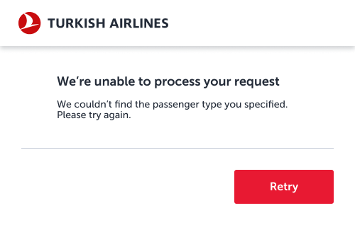
3.4. User errors
When errors are due to user actions, avoid blaming the user. Provide clear instructions on how to correct the mistake, using passive voice if necessary to soften the tone.

3.5. Status updates
These messages inform the user about a situation without implying fault. While these aren’t true errors, they share the same tone as error messages because they communicate an inconvenience or issue. Passive voice can be used here to maintain a neutral tone.
The flight time has passed.
There are no available Business
Upgrade offers for your flight.
This PIN code is no longer valid.
4. Validation errors
Validation errors differ from the other error states in their timing, guidance, tone, and specificity. Validation errors occur when user input does not meet the required criteria. Unlike warnings, validation errors stop the user from proceeding until the error is corrected. These errors should also be included a clear and guiding tone. Language should be direct and instructive. Must be highly specific to the field or input error. They directly point out what needs to be corrected.
4.1. Types of validation errors
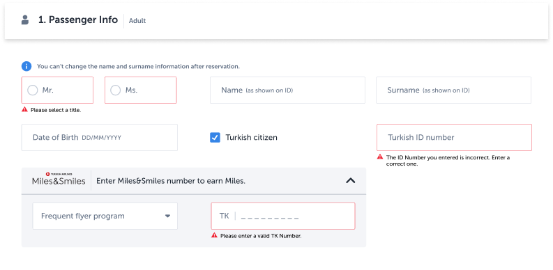
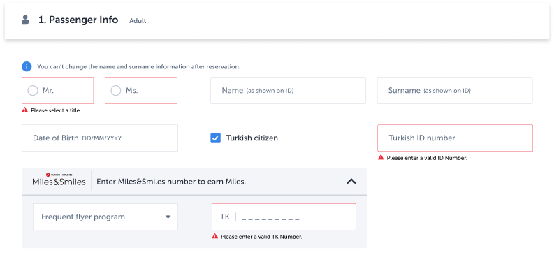
4.1. Input validations
These errors occur when the data entered by the user doesn’t meet the required format or criteria (e.g., incorrect email format or missing fields). Clearly specify what needs to be corrected.
4.2. OTP validations
These errors occur when the One-Time Password (OTP) entered is incorrect or expired. Provide a clear instruction on how to proceed.
5. Errors on mobile app
5.1. Dialogs (Modals)
Use when immediate attention or user confirmation is required. Dialogs interrupt the user flow, so they should be used sparingly and only for critical messages where the user needs to take deliberate action or be made aware of a serious issue.
When to use:
- Payment failures
- Security warnings
- Irreversible actions (e.g., deleting a booking)
5.2. Bottomsheets
Use for less intrusive, contextual information that doesn’t block user progress.
Bottom sheets are great for background errors or low-severity issues that still require user awareness but don’t demand immediate action. They allow the user to stay within the flow while being informed.
When to use:
- Session timeouts
- Temporary system errors
- Form submission issues (non-critical)
- Feature unavailability notices
6. How to generate an error message?
A practical step-by-step guide for writing better error states
Step 1: Start with the user journey
Begin by identifying where the user is and what they’re trying to do when the error occurs. Understanding context helps determine the tone, urgency, and structure of your message.
Situation
The passenger reached the payment step, entered their credit card information, but due to a technical error, the transaction could not be completed. No payment was processed.
This step is emotionally sensitive—money is involved, and the user is at the final stage of completing something important. Trust and clarity are essential.
Step 2: Build the user story
User stories combine persona insights with journey context to shape tone and content strategy. Below are two examples from the same journey, but with very different user mindsets.
👤 User Story 1: Worried User – Frederico
- 42, Portuguese, pharmacist
- Not confident with digital tools
- Concerned about online payments and fraud
- Needs clear reassurance and emotional safety
- Prefers Turkish Airlines for added services (e.g. Stopover program)
👤 User Story 2: Calm User – Aysun
- 20, Turkish, student
- Confident with tech and online banking
- Uses virtual cards and knows how to track transactions
- Needs speed, clarity, and minimal friction
- Books flights for family vacations
For more detailed information on user stories, check out this link: https://www.nngroup.com/videos/user-story-mapping/
What this tells us:
- Frederico needs to hear: “You have not been charged.”
- Aysun needs to hear: “Try again.”
- The message should balance empathy and action.
Step 3: Identify parallel scenarios
This error may occur in different flows beyond the standard booking:
- While upgrading a ticket
- While purchasing extra baggage or seat selection
- While buying Miles
Identify the common point encountered with this error through these scenarios and write accordingly. When considering the purchasing process as above, we should not mention what the users purchased.
Step 4: Recognize the error type
To write an effective message, you first need to understand what kind of error you’re dealing with. Slater Katz highlights five situations where we might encounter error messages:
- When the user enters something incorrectly
- When the user misses something
- When there is a system issue while trying to perform an action
- When the user needs to change something to proceed
- When the user finds something in the system that no longer exists
Each of these situations requires different prompts. Determine which situation applies to your current case and proceed accordingly.
In this case, based on Slater Katz’s model, the situation fits into the category:
“A system issue occurred while the user was trying to perform an action.”
This means the user did everything right—they entered their information, followed the process—but something on our side failed.
Step 5: Understand the technical cause
Before writing, consult the development team:
- What’s the actual reason for the failure? Backend? Timeout? Third-party gateway?
- Are there multiple related errors that this message should cover?
This avoids writing 3 different messages for the same user-facing problem.
Step 6: Choose the right component
This error occurs at a critical step, and users need to know immediately. Together with the design team, choose a modal dialog (pop-up) for maximum visibility and clarity.
Why a dialog?
- Requires attention and action
- Appropriate for financial transactions
- Stops user progress until they confirm next step
Step 7: Adapt for different platforms
Not all platforms present information the same way. What looks fine on desktop might break usability on mobile or tablet. Screen size, component behavior, and reading flow vary greatly—and error messages must adapt accordingly.
Let’s say you wrote a validation error that says:
“Please enter a valid credit card number in the correct format.”
This might look fine on a desktop inline field.
But on a mobile screen, it could:
- Wrap into 2–3 lines
- Push the button out of view
- Visually overwhelm the user
- Delay quick action or add confusion
In this case, format is not just visual—it’s cognitive.
For components with limited space, such as validation errors, be sure to establish a character limit.
Write with an awareness of the buttons users will encounter throughout the entire experience. The page where the error appears may not be the same across all platforms.
Step 8: Write the error message
Finally, make sure you adhere to the six principles mentioned earlier. After writing, you may want to ask a colleague to review the message for compliance with these principles.
Let’s briefly revisit the principles:
- Avoid blaming the user
- Use active voice
- Be concise and clear
- Ensure clarity and avoid ambiguity
- Align headings and buttons
- Minimize the use of punctuation
Congratulations!
If you have correctly followed all these steps, you should have written an effective error message.