Home page
1. Introduction
1.1. What is the home page to us?
The homepage is where we welcome users from all around the world and begin to showcase our hospitality. While it is a complex structure, it is designed to offer the most seamless experience possible. This pattern stands out as a place where users can access multiple services at once and easily find what they are looking for.
1.2. Our principles in home page
1.2.1. Reflection of our personality
The way you say hello shapes how others perceive you. In this pattern, where we greet users, it’s crucial to convey just how hospitable and inspiring we are.
1.2.2. Ease of experience
Words only hold meaning when turned into reality. If we claim to host our users, we must ensure a smooth, effortless experience. Avoid complex structures and phrasing that complicates usage.
1.2.3. Cultural sensitivity
We create content that caters to multiple cultures. Therefore, we respect differences, local norms, and time zones. Through our experienced translators, we capture aviation in everyday language, making this first impression on the homepage feel familiar and welcoming to all.
1.3. Why do we consider the home page as a pattern?
The homepage is a large pattern that contains numerous components. As the most important page of our platform, it remains constant, even though the components within it can change according to circumstances and needs. This adaptability ensures that the homepage consistently serves users, while evolving to meet their expectations and offer the best experience. No matter what changes occur, the homepage will always remain.
Now, let’s take a look at what components it includes and how they function…
2. Components in home page
2.1. Banner
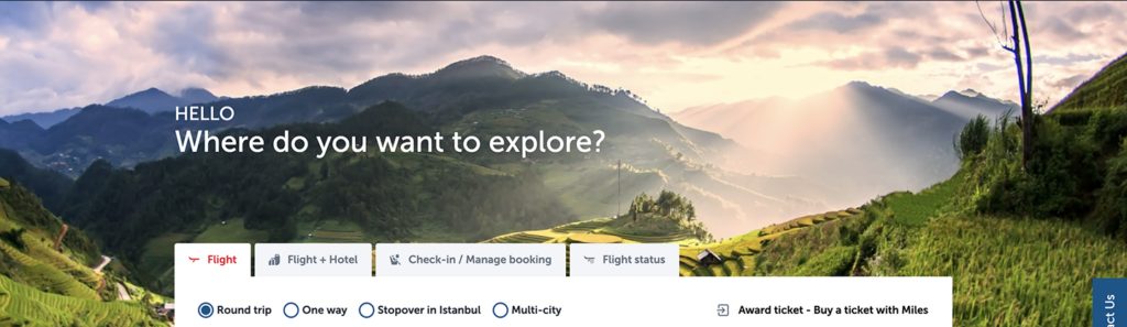
When users first land on the homepage, the banner is the first element they see. We start by showcasing our hospitality with a warm greeting like “Hello” followed by a friendly question such as “Where would you like to explore?”
- Always use a greeting phrase in the first line, such as “Welcome”, “Good Morning” or “Good Afternoon” depending on the context.
- If the user is logged in, their name will appear next to the greeting. Ensure that phrases longer than 20 characters are not used to avoid layout issues, especially when writing into other languages.
- If you need to rewrite the question “Where would you like to explore?” keep it short and use simple, easy-to-understand language. The phrasing should gently guide users to the primary function of searching for flights. Ensure it feels like a warm welcome, as if the user has entered our living room and we’re asking them, “What would you like to drink?” Remember, this is the first step in creating a meaningful experience.
2.2. Booker
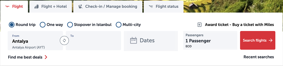
2.2.1 Flight
- Keep radio button labels short, without possessive suffixes, and use minimal punctuation.
- For the ‘From-To’ section, ensure that the airport names are truncated with an ellipsis after the 13th keystroke. Avoid anything that might be culturally inappropriate in any language, and report potential issues.
- You need to use different kinds of abbreviations here please check abbreviations.
- If you have concerns about how to write numbers you can check numbers.
- Check buttons for detailed information about writing buttons.

2.2.2 Flight + hotel (Holidays)
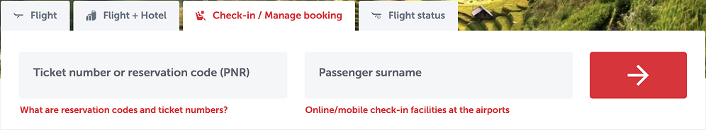
2.2.3 Check-in / Manage booking
This page allows users to quickly check in using their PNR number and surname. Make sure to clearly explain what a ‘Ticket Number’ or ‘Reservation Code’ is, as necessary.
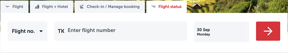
2.2.4 Flight status
- Check abbreviations for appropriate shorthand usage.
- In all placeholder text, use names, such as “Flight number,” to ensure consistency
2.3. Additional services shortcuts
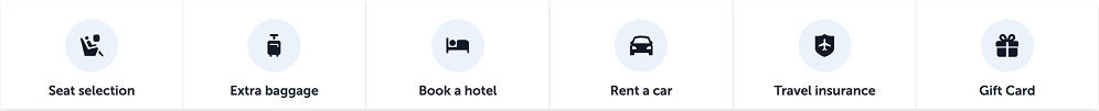
- Your main motivation is to provide a shortcut to the additional services. Therefore, the buttons must be whatever the additional service title is.
- Only SEO department can request a change to the buttons in the shortcuts. Please specify that the change they can request should be to the entire structure, not to a single button, and please be careful to maintain consistency.
- Unless it’s a proper noun, use sentence case.
- Limit to three words or fewer.
- Ensure that labels are no longer than 20 keystrokes.
- Avoid possessive forms.
2.4. Dual cards
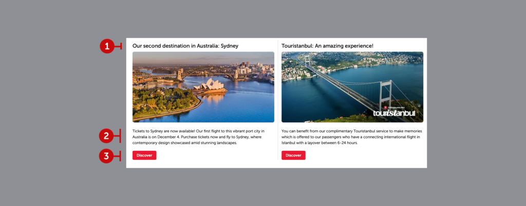
2.4.1. Heading
It allows us to convey exactly what we want to say in short and clear terms. When setting the context, you should definitely talk to the marketing and SEO departments. Please keep in mind that this is a UX copy. You are the auditors who will leave out excessive and annoying marketing language.
2.4.2. Description
We do not step back from simplicity in the explanation, which is an area where we go into more detail and target super users. Remember that you are addressing those who will really be interested in the subject here. Think about their needs. Prepare without too much ado. Marketing and SEO will convey their demands to you.
2.4.3. Prompt
Cards do not meet the systemic needs of users. These areas are designed to inspire them. In this case, it is inevitable that prompts will inspire. Prefer conversational prompts such as “Explore”, “Discover”, or “Take a tour” rather than system prompts such as “Show”, “Log in”, etc.
- Write attention-grabbing headlines that encourage users to read further. Always keep it to one line. For more headline tips, check headlines.
- Aim for the description to be no more than four lines. However, if it’s too short, it won’t look as polished. The ideal length is between two to three lines. Use as many SEO-driven keywords as possible, and refer to body text for crafting the supporting content.
- Align the button text with the headline. Keep it under three words, and always make it a verb and check buttons for more tips.
- When selecting visuals, use the visual selection for help in choosing appropriate images.

2.5. Location based campaigns
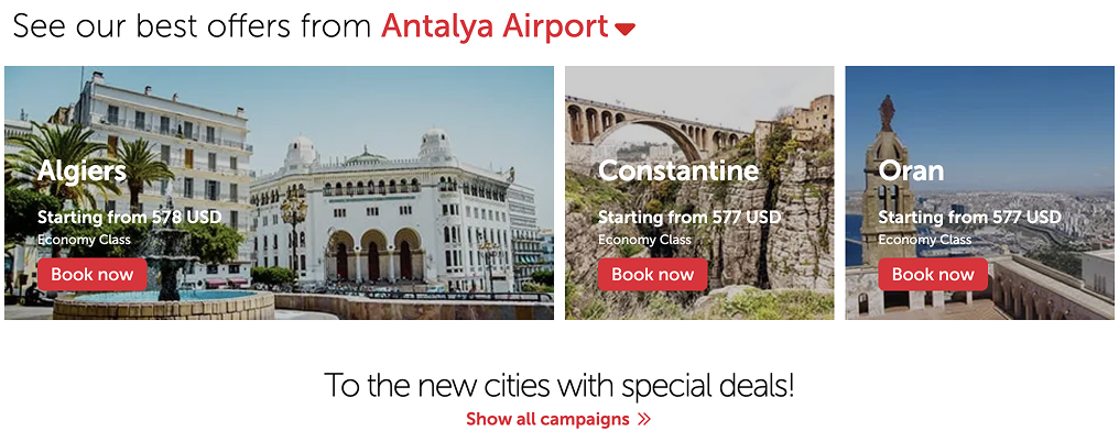
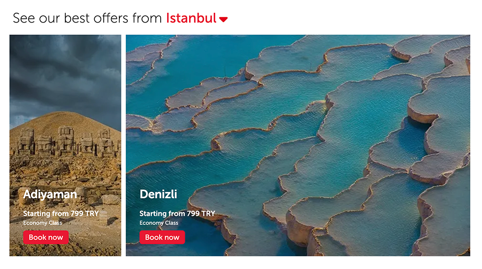
- Best price offers are displayed according to the destination selected from the dropdown in the headline. After class and price information is communicated, users are directed to complete their booking.
- Do not place text directly on the image without creating a background container. Although this will change in the design system, if you encounter an instance of this setup that reduces readability and scannability, immediately notify your supervisor to have it corrected. Coordinate with the design and development teams to assign a container for the entire area and ensure the text is displayed within this space.
- Location based campaigns can be in modules of two or three. The same rules apply for both cases.
- Write an exciting, action-inspiring headings. For more tips check headlines.
- Check body text for supporting content.
- Refer to buttons for button writing tips.
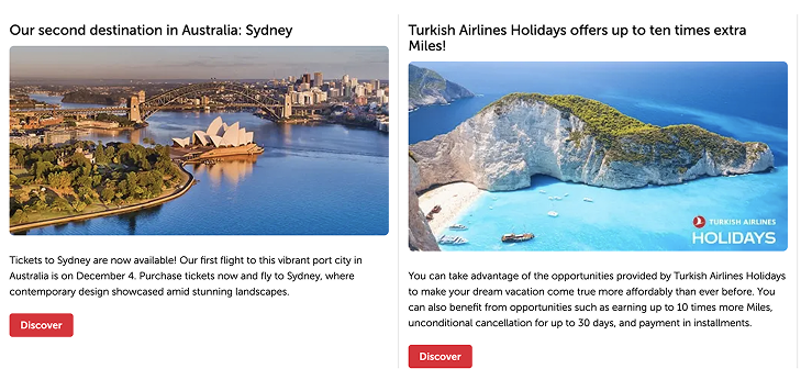
2.6. Slider cards
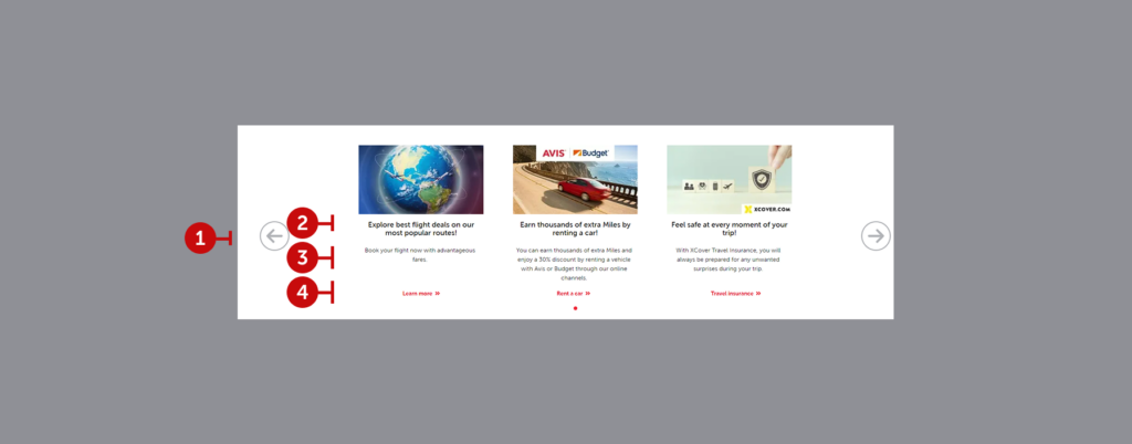
2.6.1. Chevron
It allows user to navigate to view the other banners on the carousel.
2.6.2. Heading
We aim to express our message precisely and concisely. When crafting the content, be sure to consult with the marketing and SEO teams. Remember, this is UX copy, so you’re responsible for refining the tone to eliminate any overly promotional language.
2.6.3. Description
Clarity is our guiding principle in these explanations, which are intended for users who want to delve deeper. Your audience here will be genuinely interested in the details, so consider their specific needs and avoid unnecessary flourishes. Let marketing and SEO teams communicate their priorities directly to you.
2.6.4. Prompt
Cards are not designed to address user needs on a purely functional level. These elements should inspire engagement and exploration. Opt for conversational prompts like “Learn more” “Rent a car” or “Buy insurance” over system-focused ones like “Open,” “Access,” or “Login.” The goal here is to encourage a natural curiosity. When writing the prompt, imagine it as a continuation of the headline, guiding the user directly to the content you’re promoting with a verb-rooted action that allows immediate access.

- To write here you can check headlines, body text, buttons, and visuals.
- Always keep the headline to the maximum of two lines.
- Aim for the description to be no more than four lines. However, if it’s too short, it won’t look as polished. The ideal length is between two to three lines.
- Keep the prompt under three words, and always make it a verb.
2.7 Periodic banner
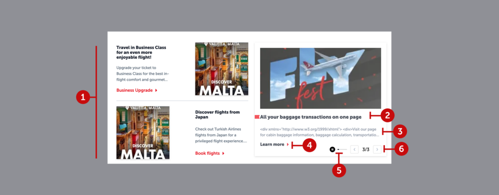
2.7.1. Static cards
These cards, which accompany timed banners, can feature various types of content. For instance, they might offer users a business class upgrade while also encouraging them to explore a new destination. They can serve multiple purposes, showcasing different options.
2.7.2.Heading
Even though the most eye-catching part of a timed banner might be its visual, the headline is key for making sure the message sticks with the user. Keep the sentence structure short and clear—go for a headline that delivers the message in the simplest, most direct way.
2.7.3.Description
It’s clear from the structure that you have a fair amount of space to play with in a banner. But don’t let that lead you into writing unnecessary details. Explain what’s needed and stop. Keep it brief—don’t drag it out.
2.7.4.Prompt
The button, often paired with a chevron icon, should be phrased like a sentence and wrap up the headline with an action. Make it feel like a natural continuation of the headline.
2.7.5.Timer
The timer is what makes this a “timed” banner. While the countdown is shown as a progress bar, users can pause it. If paused, the banner will stay visible indefinitely. This is actually a good sign—it means you’ve captured their interest. But don’t dwell on it. Always treat this banner like you’ve only got a short window to get your message across. Prioritize readability, scannability, and clarity.
2.7.6. “Current/All” banner numbers
Displaying the current banner number out of the total (like “1/3” or “2/4”) seems simple, right? But when you consider screen readers, it’s not so straightforward. Phrases like “one slash three” or “two slash four” aren’t helpful for visually impaired users. Instead, try something more descriptive: “You’re viewing the second of three banners” or “You’re on the first banner out of four.” This is more accessible and makes it easier for everyone to follow.
- To write that kind of banner please follow headlines, body text, buttons, and visuals.
- Always keep the headline to the maximum of a line.
- Aim for the description to be no more than two lines. Please write it as required by the situation needs.
- Keep the prompt under three words, and always make it a verb.
2.8. Awards
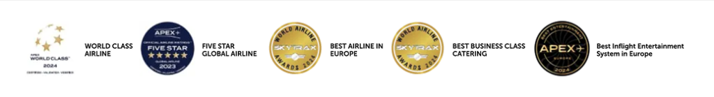
- Write awards’ full name with title case
- Don’t use it without logo
2.9. Header, Mega Menu, Footer, and Contact Us
These components remain visible on both the homepage and all subpages, providing a seamless navigation experience through an organized information tree. We prioritize making it easy for users to navigate and access our services. A user who feels lost, confused, or unsure of what to do is our worst nightmare.
Each element in these structures functions as a button. However, unlike typical buttons, they don’t trigger a specific action beyond navigation. Instead, they display the name or symbol of the product, service, or channel.
Any changes here are essentially adjustments to the information architecture. These should be approved following input from all relevant teams and thorough user testing.
For more details on how to write in these sections please check the capitalization.