Links
1. Introduction
1.1. What are the “Links” for us?
At Turkish Airlines, our passion for exploration extends to our users. We aim to introduce them to new, beautiful, and exciting destinations. Exploration isn’t just about travel—user experience supports discovery, and links are a key part of this journey.
Links are components we use to guide our users from one point to another, leading them to different contexts and enhancing their experience. In general, links serve to:
- Provide a pathway to secondary pages with supporting details and specific information.
- Guide users to external sites to complete actions they’ve chosen.
- Function like buttons when needed.
2. Principles for links
Creating links might be requested by the product owner, UX designer, or SEO specialist at any time. You can explore how to approach possible use cases by following the principles below.
2.1. Using links in headings
Do not recommend, create, or allow links in headings. They can disrupt scanning and flow. This rule applies to both internal and external links.
2.2. Taking the easy way out
While links can support navigation without disrupting design, they do not provide accessible results for every label. Only create links for genuinely necessary resources to avoid exposing users to dark patterns.
2.3. Redundancy
Avoiding multiple links in one sentence supports accessibility by preventing confusion and giving screen reader users a clear, sequential reading path.
2.4. Linking relative phrases, not full sentences
This helps keep links scannable and ensures they provide contextual meaning. It is also aligned with SEO best practices, where concise, relevant anchor text performs better.
2.5. Establishing context
Remember, links present a different context, even when directing users internally or externally. Avoid linking to actions that users are expected to take in that phase of the experience. Buttons are there specifically for these actions. This distinction supports a clean and intuitive user experience.
2.6. Clear, specific, and descriptive
It e nables users to understand the destination or purpose of the link without needing extra context. For users zooming in on text, magnification may only show part of the screen, so link text needs to be instantly understandable.
Click here
…view our Accessibility Guide
2.7. Sufficient spacing and avoiding clutter
Links should be easy to tap or click on without risking accidental taps on adjacent elements, which magnification-friendly design supports.
2.8. Distinct visual cues
Ensuring that links are clearly styled (e.g., underlined and using accessible color contrasts) signals interactivity, which is especially crucial for users relying on magnification. Clear cues help users recognize links immediately, keeping them from guessing which words or phrases are interactive, improving navigation and efficiency.
2.9. Avoiding full-sentence links or large clickable areas
Links should focus on specific words or short phrases to convey context without overwhelming the reader. Breaking down links into short, meaningful phrases enhances clarity, letting users understand their choices at a glance and reducing the need for extensive backtracking or re-reading.
2.10. Consistency in placement and labeling
It builds user trust and creates a predictable experience, making the interface intuitive and easy to follow. This helps them find what they need without navigating back and forth.
2.11. Usability tests
Regularly testing links in magnified views helps detect issues like broken layouts, cramped links, or unrecognizable text that could hamper navigation. Push your team to test it.
2.12. Keyboard navigation
Motor and visual impairments and screen reader users navigate content solely with keyboards, so link placement, style, and behavior significantly impact accessibility. Ensuring that links can be easily identified and accessed through keyboard shortcuts by following the principles:
2.13. Distinguishable from other texts
We naturally give them color contrast and underline to indicate interactivity. UX writers can support this by making sure links are phrased uniquely from regular text, so they stand out both visually and contextually.
2.14. Accessible and action-oriented language
Keyboard users need to understand the purpose of each link quickly, as they may not have the luxury of hovering over links to preview content. Action-oriented language (e.g., “Join the webinar” rather than “Click to register”) makes each link’s intent instantly clear, supporting a smooth and intuitive navigation experience.
Click to register
Join Miles & Smiles program
2.15. Grouping and structuring content
Keyboard navigation through many links can be tedious, especially if links are redundant or spread out in a way that feels cluttered. Related links should be grouped logically, and excessive link usage should be minimized to avoid clutter and confusion.
2.16. Logical and predictable order
For keyboard users, links should be arranged in a logical tab order, reflecting the flow of information. When link text is clear and organized logically (such as following a narrative or task order), it helps users navigate without feeling lost or needing to backtrack. Proper content hierarchy and sequence also support screen readers.
2.17. Color contrast
Link visibility, particularly in terms of color contrast and size, is crucial for users with low vision. As content designers you are natural-born auditors and may check the test screens whether they are compatible with color contrast or not.
2.18. Consistency and usability
To enhance your impact when establishing a consistent and usable experience with content follow these principles:
2.19. Building trust in the interface
Help users feel in control and understand what to expect. When users know that links will behave in a certain way (e.g., external links are clearly indicated or open in new tabs), they feel more secure and confident navigating the content. Foster this trust by ensuring all links are clearly labeled and used purposefully, avoiding dark patterns or confusing phrasing.
2.20. Adhering to conventions
Follow web conventions that users are already familiar with for link styling, placement, and labeling. So the users don’t have to “learn” new interaction patterns for each page. This is especially helpful for users with cognitive disabilities or those new to digital interfaces.
2.21. Avoiding cognitive overload by standardizing actions
Each link should clearly indicate the action or result it will trigger, and similar actions should use the same phrases. For instance, if one link says “Read more” and another similar link says “Discover more details,” users may be unsure if they will get the same type of information. By standardizing language, you can reduce ambiguity and make navigating through links more intuitive and efficient.
2.22. Enhancing scannability
Content should be organized in a way that allows users to scan for information and links. This scannability is essential for users who rely on magnification or screen readers, as they may skip around the page looking for key links. Enhance this experience by keeping link text concise and front-loading important words to make scanning more intuitive.
2.23. Establishing predictable patterns
Use consistent, familiar phrases and formats for similar types of links. When users encounter familiar language across links (e.g., “Learn more,” “Download,” “Read more about”), they can easily understand what each link will do, without having to decipher new language each time. Predictable language reduces cognitive load, making it easier to process content efficiently. Contribute by ensuring link language is standardized across Turkish Airlines, so users always know what to expect.
2.24. External content caution
–
(External linkler hakkında tasarım kararı verildikten sonra bu kısım doldurulacaktır.)
Let’s explore our approach to organizing link content and identify best practices across various components and structures.
3. Links
3.1. Buttons leading to action
These buttons are directly connected to preceding text, typically leading to detailed information or a related resource on another page. Punctuation should not be used with these links, as they are not full sentences; instead, express them with clear, direct verb phrases.
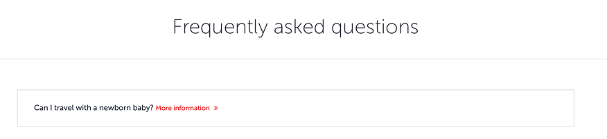
Links offer users a straightforward path to explore. Always keep the surrounding context in mind—“Learn more” or “More Information” are not accessible.
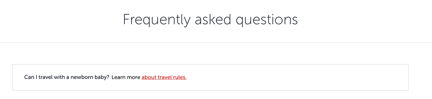
3.2. In-line links
Embedded within paragraphs, these links need to stand out within the text to catch the user’s attention.
3.2.1.
Avoid single-word links, even if they are keywords or strictly direct the user to the subpage.
Page
Click or Click here
Tap or Tap here
More, Read more or Learn more
Continue
Link or this link
Details
Go
Submit
Here
3.2.2.
If a link initiates an action, be sure to include the action within the link itself.
3.2.3.
If the link provides information only, use noun phrases for clarity.
3.2.4.
Always keep in line with SEO when you are writing for links.
3.3. External links: External links
We should also feel the external link in terms of design. Therefore, even if we clearly write where the user will go, the UI designer should make the user feel that they will go outside with an icon.
4. Accessibility for links
4.1. Why accessibility of the “Links” are crucial?
Links can be confusing not only for users with visual impairments but for everyone. Beyond clarity and scannability, our goal should be to create fully inclusive links that are compatible with screen readers and keyboard navigation, have appropriate color contrast and size, and are accessible to all.
Below, we provide the principles we recommend following. For link design, be sure to consult with product owners, UX designers, UI designers, and SEO teams. Collaboratively agree on general principles before moving into large-scale implementation.
4.2. Screen reader compatibility
Links need to be accessible for screen readers, which means they require appropriate text, descriptions, and structure to make navigation easy for visually impaired users. In this context, anchor texts are highly important for accessibility. They need to say only one thing and then lead to a relevant page about the content.
If an anchor text underline an insurance topic, the following page should only be included that insurance topic. If the following page includes many other topics, screen reader users may lost and scroll to the uncertainty.
Learn details and get a quote on how to ensure peace of mind with XCover Travel Insurance.
Ensure peace of mind with XCover Travel Insurance.
4.3.Magnification friendly design
When considering mobile and desktop use, operating systems allow users to magnify in a way that is compatible with the screen. The design should generally be compatible with magnification. On the other hand, some sort of components such as links require special attention due to the variability of their usage areas.
When creating a link, be sure to consider the principles.