Other Components
1. Introduction
1.1. What does “Other components” mean to us?
“Other components” refer to elements within our design system that, while not specifically categorized under defined patterns like the homepage or additional services, still serve specific design and communication needs. These components are developed with particular use cases in mind and should only be utilized in exceptional scenarios or when truly necessary.
Let’s dive deeper into the situations and contexts where these components come into play.
2. Components
2.1. Carousel with heading
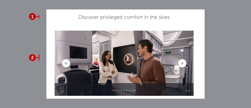
When you need to showcase multiple images about a single topic, the carousel component becomes a valuable tool.
2.1.1. Heading
For the carousel with heading component, you are responsible for crafting an engaging, inspiring, and concise title that aligns with the visual content. The heading should act as a call to action, encouraging users to explore the carousel.
This component does not stand out as a primary element on the page. Before using it, review other text areas on the page to ensure there is no redundancy in messaging. Repetition can harm the user experience. Instead, maintain the meaning while varying the language with synonyms or related terms.
We recommend keeping the heading under 40 characters and within a single line. Always preview your text in the design and revise it if necessary.
2.1.2. Visuals
While you are not responsible for selecting visual content for this component, you should brief your designer effectively. Guide them to choose appropriate visuals that align with the content and maintain the correct sequence.
2.2. Banner with icons
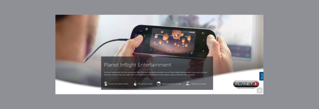
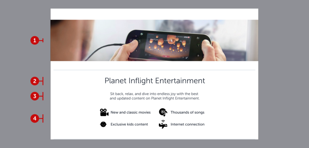
The “Banner with Icons” component enhances the structure of “visual + heading + description” by integrating icons. These banners can be seen in both old and new designs, with variations in their presentation.
In older designs, the heading, description, and icons are placed within an overlay. In newer designs, these elements are displayed within a separate container. Let’s explore the elements of this component and how to use them effectively.
2.2.1. Visual
Use images that align with the topic, band together with content, also comply with visual guidelines.
2.2.2. Heading
Like all headings, it should be short (no more than 40 characters), clear, and action-oriented. It must inspire the user to take the next step.
If the example heading doesn’t align with these principles, don’t worry—quick tips below will help refine your approach.
All of which should be written in title case, because they are completely product names.
2.2.3. Description
Descriptions should expand on the heading, providing additional context and inspiration for the user. They should be scannable, easy to read, and designed to convey both emotion and essential information quickly, allowing the user to proceed smoothly within the flow.
2.2.4. Icons
For design-related considerations like icon spacing or alignment, consult with your designer. When writing for icons, keep the following in mind:
- Do not exceed 45 characters.
- Avoid writing full sentences. Treat it as creating a “chip” with concise and scannable phrases.
- Do not include action verbs. Action-oriented language can make the icon feel like a button, which might mislead the user.
- Focus on simplicity, clarity, and attention-grabbing language that serves the user, not a marketing agenda. Remember, the goal is not to sell but to promise a better experience.
2.3. Single cards (horizontal)
Our card structures differ slightly from traditional ones. Although they resemble banners in size, they function as cards and can be used individually. These single cards can be lined up to convey multiple topics. Additionally, their inclusion of buttons directs users to gather more detailed information. Let’s take a closer look at their anatomy.
2.3.1. Visual
Use images that align with the topic, band together with content, also comply with visual guidelines.
2.3.2. Heading
Like all our headings, they should be short (no longer than 40 characters), clear, precise, and written in a sentence structure to encourage user action. If the card does not contain a button, you can use a noun phrase instead of an action phrase. Focus entirely on the nature of the story and craft a suitable heading accordingly.
2.3.3. Description
As with all our descriptions, it should elaborate on the topic mentioned in the heading and inspire users about what awaits them. It should be scannable and easy to read. After conveying the emotion and providing the necessary information, it should enable users to quickly continue their journey.
2.3.4. Prompt
In user experience, the prompt sent to the system is essential for providing a clear indication of what will come next. As a user, I press the button based on this motivation—or I don’t. Adhere to this principle for any button you create, not just in this component. Specifically for single cards, consider the following principles:
- Always use action-oriented language.
- b. characters.
- Ensure it makes sense for users who might only read the headline and the button together. The button should complement the headline.
- Indicate that all detailed information will be available on the linked website.
- Use commonly used phrases like “Explore”, “Discover”, or what the expected action is.
2.4. Horizontal cards
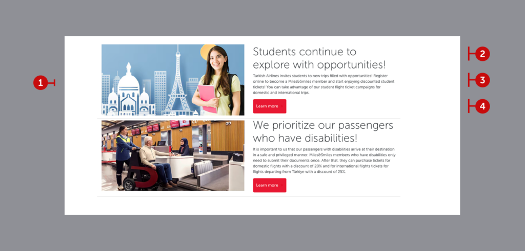
These card structures, used for additional services, are horizontally designed on some pages. Of course, the overall page layout must be suitable for this component. If the page flow does not accommodate this structure, avoid using it. Secondly, if the explanation of the topic you want to convey is slightly longer than usual, this component might be a good choice.
However, remember that the descriptions for both topics must be of similar length. We maintain the same meticulous attention to ensuring line count consistency in this structure.
2.4.1. Visual
Use images that align with the topic, band together with content, also comply with visual guidelines. Do not overlook visual harmony. If one card’s visual is a photograph, the other must also feature a photograph.
2.4.2. Heading
Unlike general heading structures, dual cards offer slightly more space. However, do not let this extra space mislead you. Always opt for the clearest, most concise explanation.
For example, the heading related to individuals with disabilities above could have been explained in a single line. However, the heading about students was extended to match the two-line format for consistency. This demonstrates the importance of formal consistency in our content design system. When writing headings, follow these rules:
- Do not exceed 52 characters.
- Write action phrases, as we do in all buttoned card structures.
- Ensure the action aligns with the button’s action. As seen above, students discovering opportunities or individuals with disabilities taking action for more information clearly complete the desired action.
- Keep your expression short, clear, and attention-grabbing.
- Maintain alignment in line counts and use proper line breaks. Correct points for line breaks include after punctuation marks and before conjunctions or prepositions.
- Keep grammatical structures like “noun and article,” “compound verb,” “verbal phrases,” or “subject and verb” within the same line.
2.4.3. Description
Unlike general description structures, this format provides slightly more space. While the extra space might seem appealing, it should not lead you to write unnecessarily long sentences or out-of-context paragraphs. For a well-crafted description section, follow these guidelines:
- Provide only as much information as needed. After all, you are redirecting super-users who may be interested in the topic to a secondary page. A long description will likely result in an output that the user skips or abandons.
- If you need to provide extensive information, focus on categorizing it. Bullet points will be your greatest ally in this regard.
- Organize the information logically. Use bullet points to ensure the categorized information is easy to scan.
- Avoid long sentences. No user wants to read a three-line sentence in an interface. If a sentence is long, don’t hesitate to break it into two or three parts.
2.4.4. Prompt
In user experience, the prompt sent to the system is essential for providing a clear indication of what will come next. Adhere to this principle for any button you create, not just in this component. Specifically for horizontal cards, consider the following principles:
- Always use action-oriented language.
- Keep it concise to ensure readability on mobile and web platforms. It should not exceed 15 characters.
- Ensure it makes sense for users who might only read the headline and the button together. The button should complement the headline.
- Indicate that detailed information will be available on the linked website.
- Use commonly understood phrases like “Explore,” “Discover,” or the expected action.
2.5. City banners


These components notify users about campaigns originating from their city or country. What happens if there’s no campaign? Do we remove the component entirely? Of course not. Since Istanbul has become a hub airport, it displays available flights originating from there, offering users options from different continents.
The component includes a heading-specific button, a banner, and a button redirecting to the campaign page, functioning as a pattern in itself.
2.5.1. Heading with button
This heading area, specific to the component, essentially serves as a secondary button. Users can change their departure point to find the best offers from other cities served by Turkish Airlines. These expressions cannot be altered. Their inclusion in the guide aims to ensure cultural appropriateness in localization efforts. The area is divided into the following elements:
- Static expression: Part of the heading is static and coded in the front end. Highlight “best offers” and the preposition “from” in the local language. Choose the clearest, most accurate, accessible expression in the local language.
- Dynamic expression: The city in the heading is dynamic and coded in the back end. If there is a flight from the user’s closest city, it is displayed as the default. If no specific campaign is available for that city, Istanbul appears as the default. In local languages, ensure the dynamic city is not separated by any punctuation. Refer to the best practice below for inspiration.
In Turkish grammar, “from” is not used as a preposition but as a case suffix. Since city names are proper nouns, they are separated with an apostrophe. The exact equivalent of the expression in Turkish would be “İstanbul’dan en iyi fırsatlar”(“The best deals from Istanbul”). However, since the city is a backend element, we position the phrase as “İstanbul kalkışlı en iyi fırsatlar” (“The best deals departing from Istanbul”) to create a clear and understandable design. Please ensure this sensitivity in your local language as well, and make sure not to divide the city name.
c. Secondary button: In the integrated structure, the secondary action of this area is to change the departure point. The primary action is to display all campaigns to the user. Each card must include a primary button, as it offers only one action by nature. The secondary expression here should clearly indicate the user’s option to change their departure location. Consider this when designing content in your local language.
2.5.2. Banner
Banners, with their inspiring cityscapes, lowest ticket prices, class-specific pricing, and easy reservation features, encourage quick bookings. Let’s evaluate the elements and highlight important considerations.
- Visual: The most striking aspect of banners is selecting the correct city photo that will captivate the user. Your designer will handle this. Your task is to check whether the overlay ensures the text is readable. If not, adjust the photo position, increase the overlay transition, or choose a different photo.
- Title: This element serves as a clear header for the page. It does not include any names or action phrases; it only contains the name of the city. One important consideration is to avoid using banners in small sizes for cities with long names (e.g., Rio de Janeiro, Buenos Aires, etc.) and to ensure the title does not extend to two lines.
- Text area: lorem
- Button: lorem
2.5.3. Seperator text area
Separator elements are commonly seen in login flows. They are frequently used in products offering multiple login options. Here, we provide the user with the option to view all campaigns and introduce them to a more detailed list. When adapting this element to the local language, pay attention to the following:
- Separate with the expression that follows the conjunction “or.”
- Use the local equivalent of our brand slogan “Widen your world” or a similar phrase.
- Inspire users and remind them that we offer other special opportunities as well.
2.5.4. Primary button
Clearly and explicitly state the main action to show all campaigns. When designing this button in the local language, follow these principles:
- Avoid inaccessible phrases like “see” and prefer inclusive expressions like “view,” “show,” or “go to.”
- Make sure to use determiners like “all” or “entire” so that the user gets a hint that many more campaigns await them.
- Ensure that the word you choose, such as “offer” or “campaign,” aligns with the information architecture of the next step. Select a word accordingly.
2.5.5. No offers to show
In some cases, there will be no offers to show as a city banner. In that cases, keep all the elements except banners. Thanks to the existing content structure, you do not need to design an additional empty state.
2.6. Triple cards with overflowing visuals
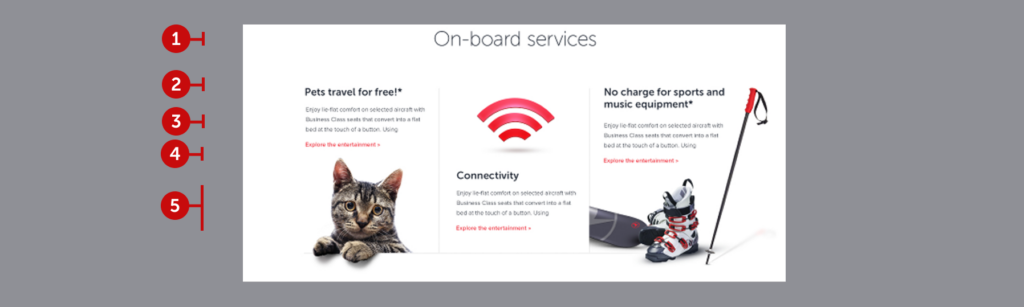
Three-card structures are the perfect fit for showcasing our services. We love them and are constantly pushing the boundaries to diversify them. Overflowing visuals are a prime example of this diversification. Let’s examine their anatomy and the key points we need follow.
2.6.1. Main heading
As seen in best practices, the main heading can either include the service name or a stimulating phrase about the service. The primary motivation behind being a noun phrase is it wouldn’t be complete with a CTA button. It should inspire users to be divided into sub-sections that direct users to different subpages.
- Follow the character limit: Strive to keep headings under 32 characters. Since the heading is written in a larger font, it should not wrap to a second line and should balance with the cards below.
- Be inclusive: Ensure that the heading fully encapsulates the topic as it doesn’t include a description.
2.6.2. Card heading
Similar to the best practice, the heading can either include the service itself or a statement that directly benefits the user. The primary motivation here is to target not only the super users who read the description carefully, but also the mass audience who will interact based on the heading. Create a heading that is inspiring and has the potential to initiate a call to action.
- Follow the character limit: Don’t exceed 48 characters and avoid wrapping to a third line.
- Be inspiring and action-oriented: Choose a heading that is inspiring and has the potential to lead to a button click.
2.6.3. Description
Here is the principles that you should follow while creating a description.
- Be consistent: The descriptions in all three cards should be of similar length. While there’s no specific character limit, they should not exceed three lines.
- Make sure about the clarity and conciseness: Ensure it conveys the main points and is well-structured.
- May use bullet points: Use bullet points consistently across all three cards if they help to convey the information more effectively. However, limit each card to a maximum of three bullet points.
2.6.4. Prompt
Always imagine the next step, don’t forget the brevity principle and keep in your mind the following ones.
- Be clear while creating: The primary button should clearly indicate the next step for the user.
- Be concise: Keep the button text short, clear, and direct. Avoid wrapping to a new line.
2.6.5. Overflowing visuals
Finally, it is good to mention the rockstar of this structure. Whereas reasonable levels of overflow make written content look like it has errors, also makes visual content flawless. As seen in the best practice, overflowing visuals add extra dimension to your 2d page. In this way, in addition to be cool, you can attract the attention of users and have the opportunity to convey the entire message.
Work closely with your designer when choosing visuals. After finding suitable visuals, balance the design. Don’t make an entire page with overflowing visuals. Use this structure where the user needs to be aware.
2.7. Experience block
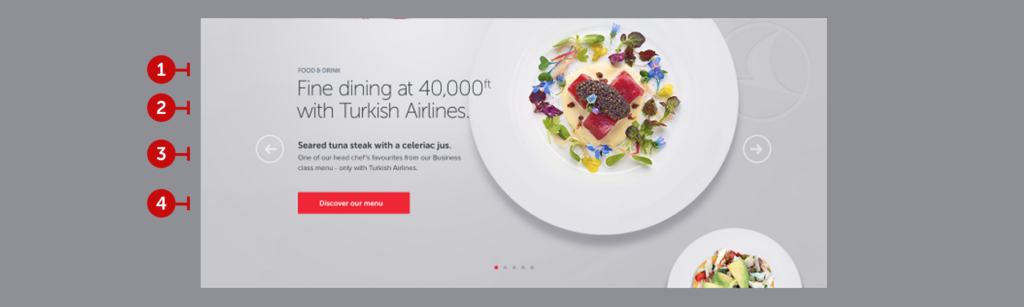
Experience blocks are used to highlight key experience points. Typically presented in a carousel format, these structures are designed to grab attention and direct users to the relevant topic. Let’s break down their anatomy and outline the key principles to follow.
2.7.1. Main title
Provide the title of the main category the experience belongs to. The title should be as short and inclusive as possible to ensure clarity and relevance.
2.7.2. Heading
Here, you should craft a tagline. Focus on creating an engaging and curiosity-driven phrase that emphasizes the specific aspect of the main title. Avoid ending the phrase with a period. Consult with the SEO team to identify the keywords they want to emphasize, and choose your tagline accordingly. Prioritize simplicity and clarity in delivering the message.
- Follow the character limit: Keep it under 42 characters, and avoid extending to a third line.
- Be inspiring and action-oriented: Choose a tagline that motivates and encourages users to click the button.
2.7.3. Description
Follow these principles when writing a description:
- Maintain consistency: Ensure all three cards in the carousel have descriptions of similar lengths. While there isn’t a strict character limit, aim for descriptions that fit within three lines.
- Focus on clarity and conciseness: Make sure the description communicates the main points effectively and is well-structured.
- Describe the visual: Write a description that complements the image. The text and visual should work together seamlessly to convey the message.
2.7.4. Prompt
Always envision the next step for the user and adhere to the brevity principle. Keep the following in mind:
- Be clear in your wording: The primary button should explicitly guide users on what action to take next.
- Be concise: Keep button text short, clear, and to the point. Use maximum 3-4 words.
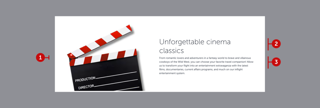
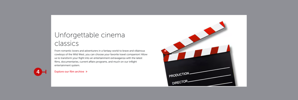
2.8. Highlighted image with text
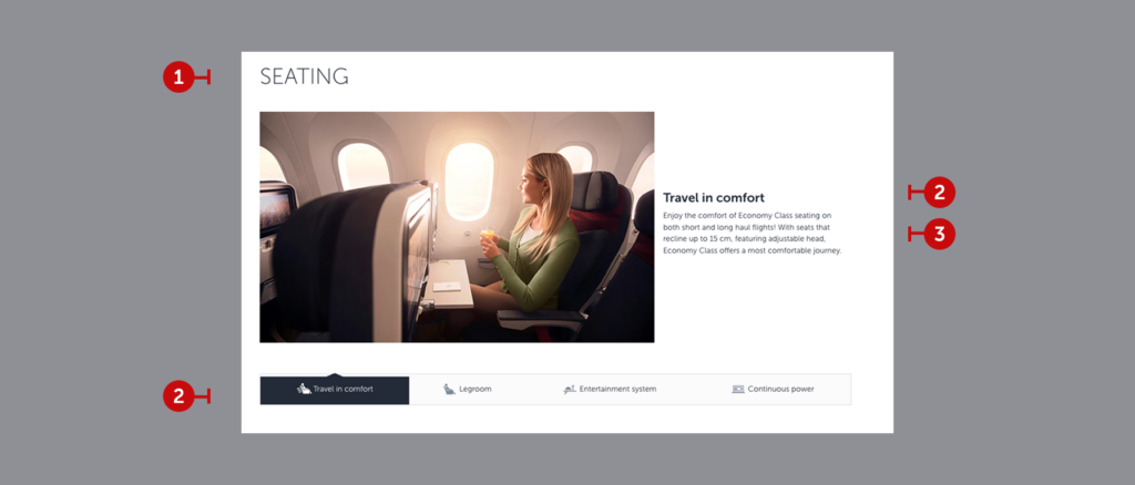
These components are used to illuminate the opportunities provided by a specific feature, diving into its finer details. Think of this section as a marketing page where you describe every detail in its most appealing and polished form, making the reader want to experience it immediately. Don’t forget to include SEO keywords and aim to create content that feels like an advertisement.
2.8.1. Main title
This is the primary title, where you clearly state the feature being highlighted. It should appear at the very top of the page.
2.8.2. Heading
What specific aspect of the feature are we highlighting? Convey this in just 2-3 words. The heading should be concise, as it will also serve as the label for the accompanying button. While crafting it, keep in mind that you are simultaneously writing the button text. Feel free to use elegant descriptions and stylish expressions.
- Follow the character limit: Ensure it doesn’t exceed 20 characters and 3 words.
2.8.3. Description
- Follow the character limit: Keep it under 180 characters and ensure it fits within 4 lines.
- Give details: This is the perfect place to share details that couldn’t be included on other pages. Use rich language and meaningful descriptions to make users feel as though they are experiencing the feature through your words.
- Focus on clarity and conciseness: While details are important, avoid writing a novel. Strike the right balance between being descriptive and staying succinct.
- Describe the visual: Create a description that enhances and complements the image. The text and visual should seamlessly work together to convey the intended message.